The Disabled Traveler
Brand Redesign
The Disabled Traveler is the principal resource for disabled traveling in national parks and beyond. They are a non-profit located in Lapeer, MI, and their goal is to remove much of the unknown in our national parks that concerns visitors with a physical disability or age related difficulties, so that they may have the best experience possible. They accomplish this by photographing national parks and their disability access, as well as gathering facts and statistics about each park's handicap accessibility features. This information can be accessed through their website, tdtcompanion.com (Check out their current website to view their current brand, logo, and web design). Finding out accessibility information on national parks is a very difficult process—the Disabled Traveler strives to bring this information together in one easy-to-use place, making accessibility information, well, accessible. Right now, the Disabled Traveler's website is a bit outdated. I wanted to refresh their brand and build up their website so that this important information is simply laid out and easy to understand.
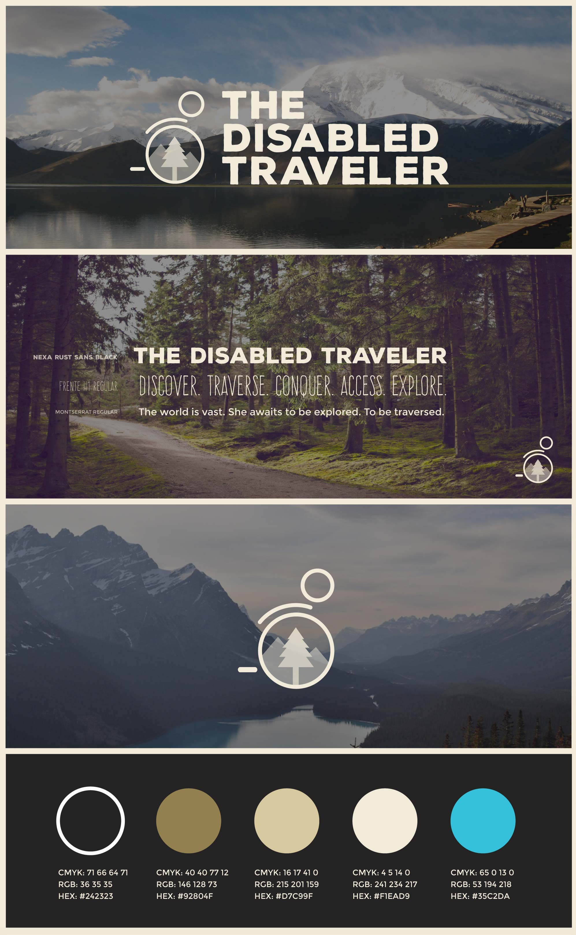
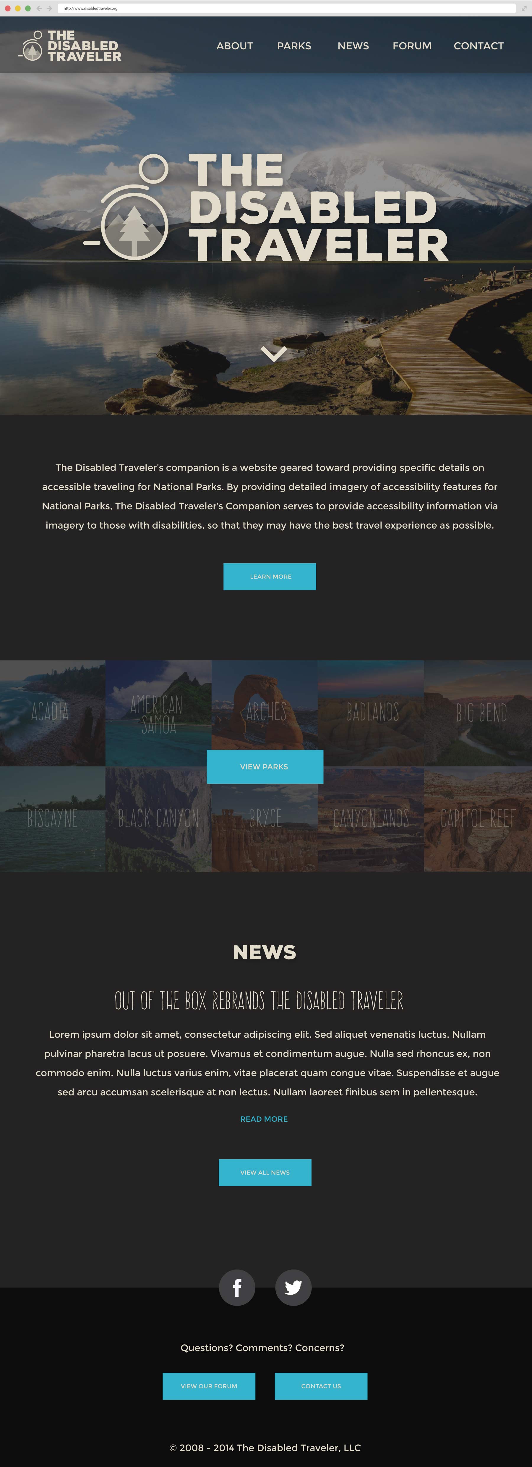
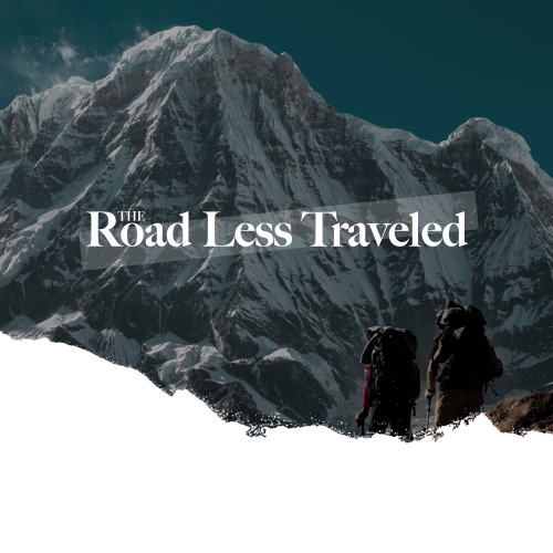
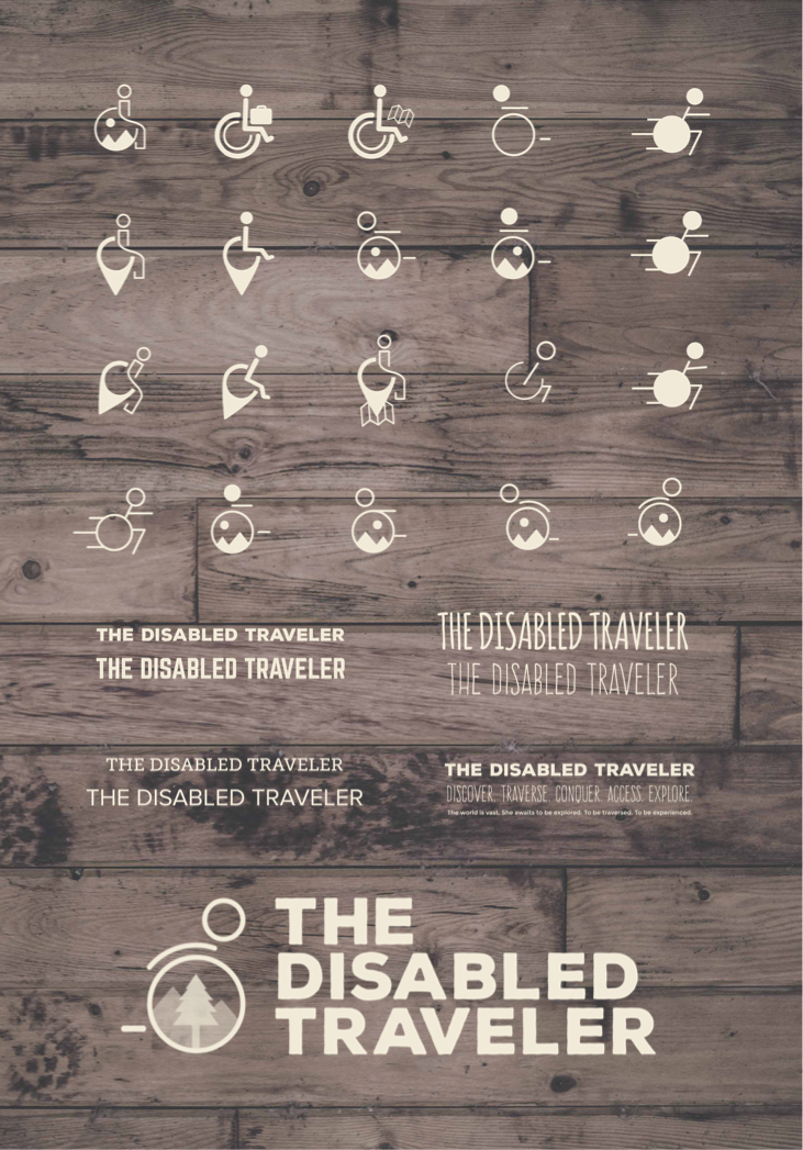
Working with MSU Out of the Box (A group of multimedia students focused on rebranding non-profits), We will actually be rebranding and implementing the re-design for the nonprofit: The Disabled Traveler in early 2015. We will be creating a new website, logo and social media pages for them so that their information on handicap accessibility can be easily accessed by the public. Besides the rebranding, we’re heading to Zion and Bryce national parks over spring break to document each park’s accessibility features. Acting as lead designer for the team, I envisioned a new, refreshed, and modern re-design for the Disabled Traveler, that will ultimately make accesbility information for National Parks more accessible than ever before. Through the logo, the new brand, and the new web design, the Disabled Traveler will truly be seen as the forefront of disabled traveling within national parks and beyond. Below you can see the refreshed brand guide, logo, and type treatment.
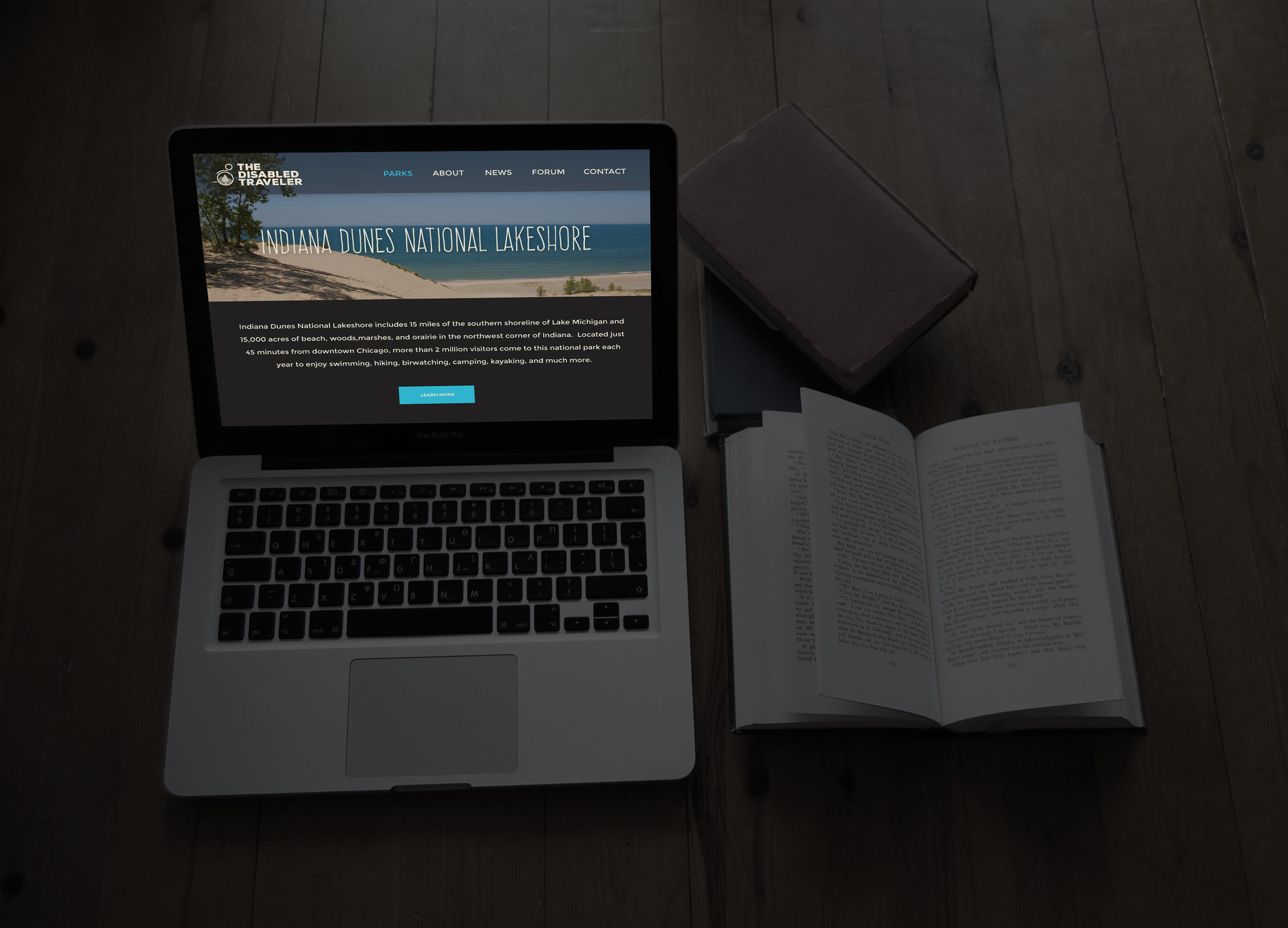
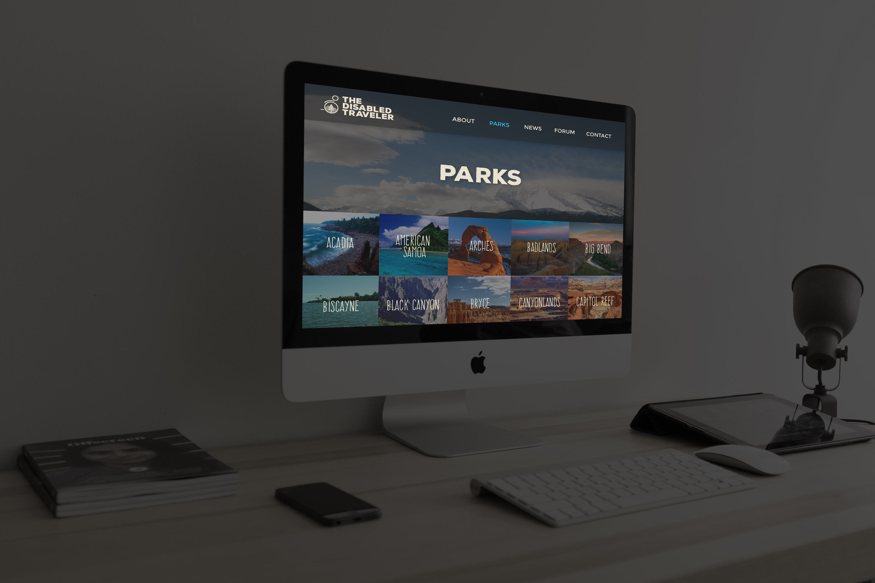
The new website had to be as simple, clean and intuitive as possible. I want the user to be able to quickly and naturally find and view accessbility information on National Parks without even having to think about it. I removed all of the clutter that was available on their old site, and broke the new site down to only include the main functionality of finding and viewing acessibility information. The site also focuses immensely on large, engaging imagery, in order to inspire it's users to visit the associated National Park. I also included interactive maps powered by google, to visually allow the user to see the attractions and trails for each national park. You can see the visual design for the new website below.