Matrix Site Redesign
Website Design
Design and Frontend Development for matrix.msu.edu
Overview
As the Head of Design at Matrix, I was given the opportunity to redesign and build our new site from scratch. Using an iterative design process, my team and I were able to revamp Matrix's site, bringing expected content into focus, and designing a more simpler, intuitive interface. Check out the redesigned live site at matrix.msu.edu
Origin
Based off of user testing and analytics, we discovered that the main reason users visited our site was to learn more about a project, or to simply go to the project's URL. With this in mind, we knew listing out our featured projects first and foremost needed to the new site's main feature. Adding more details to project pages, with information on how to donate to the project was also a must. A simpler navigation, a clearer focus on what Matrix is, and an easier way to support matrix were also considered.
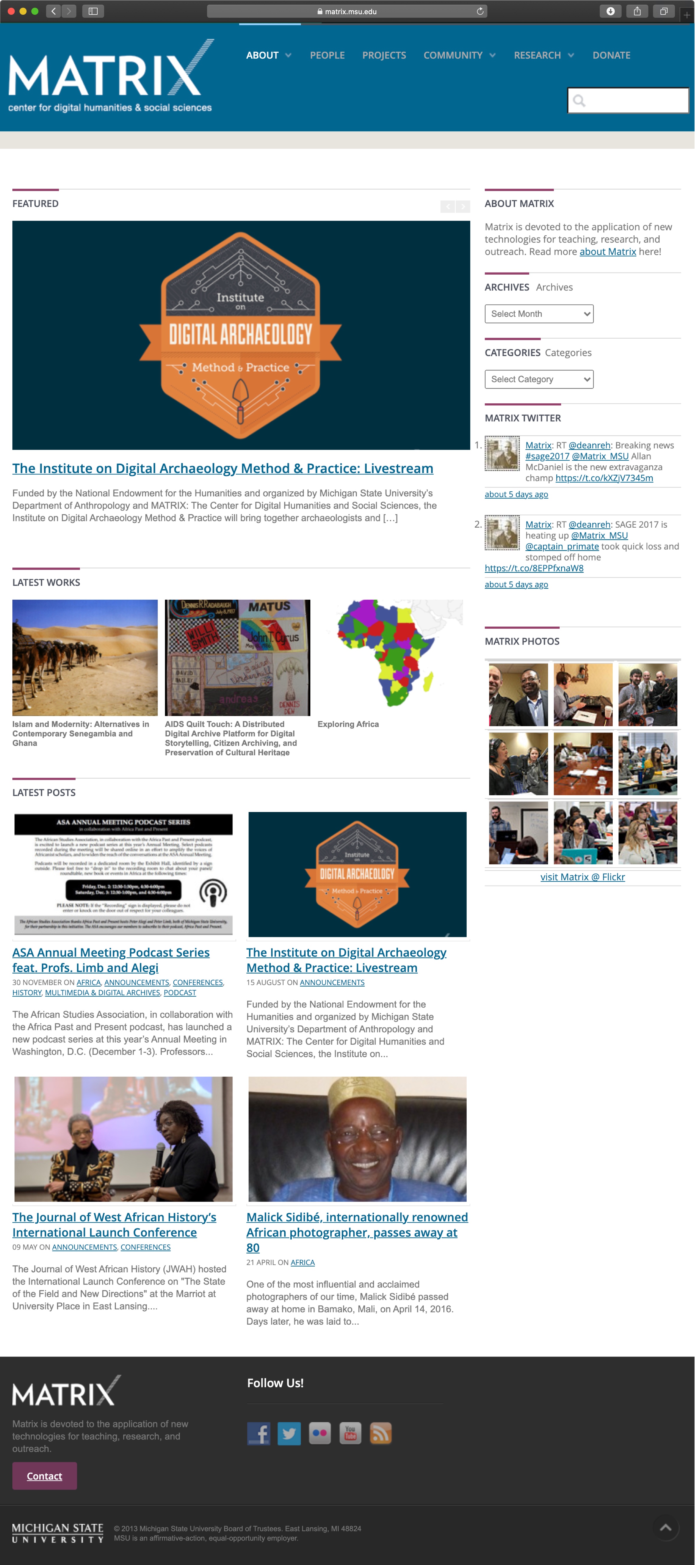
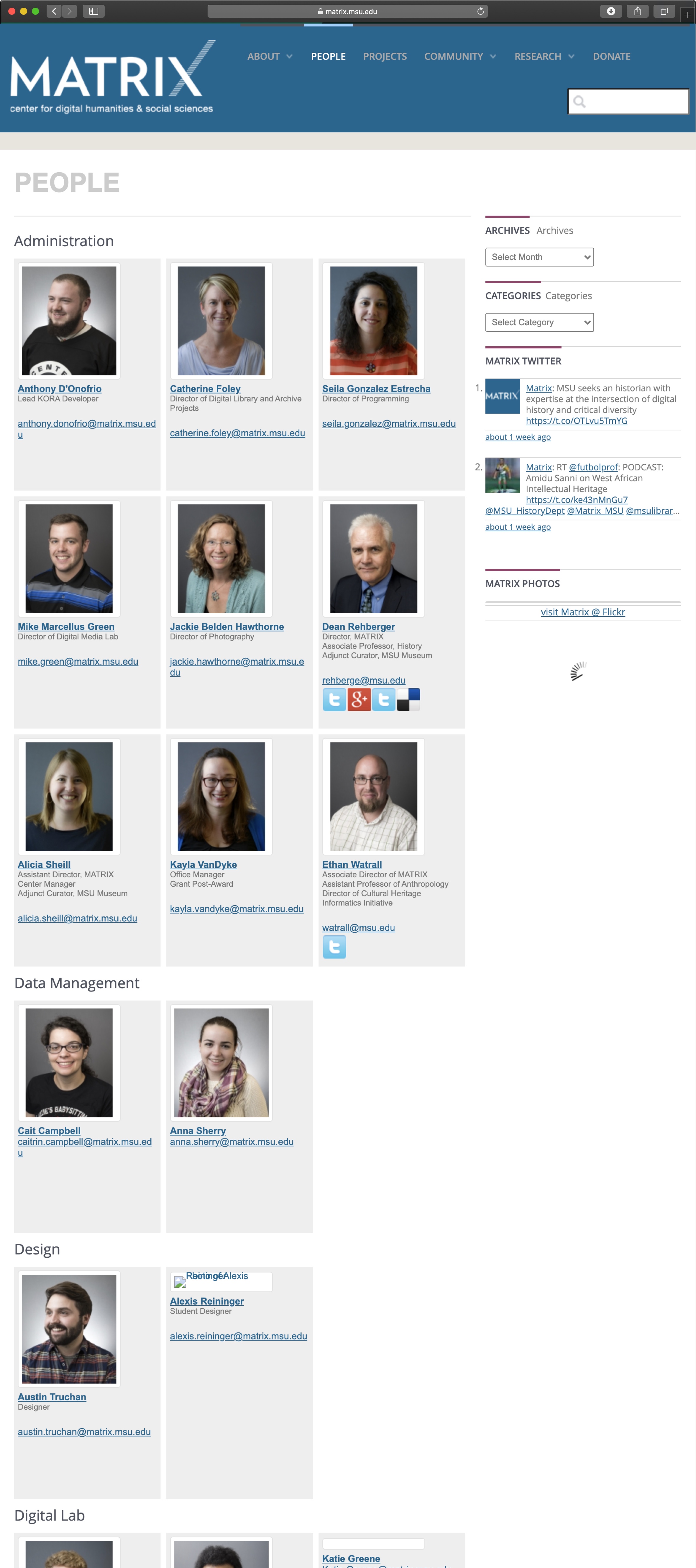
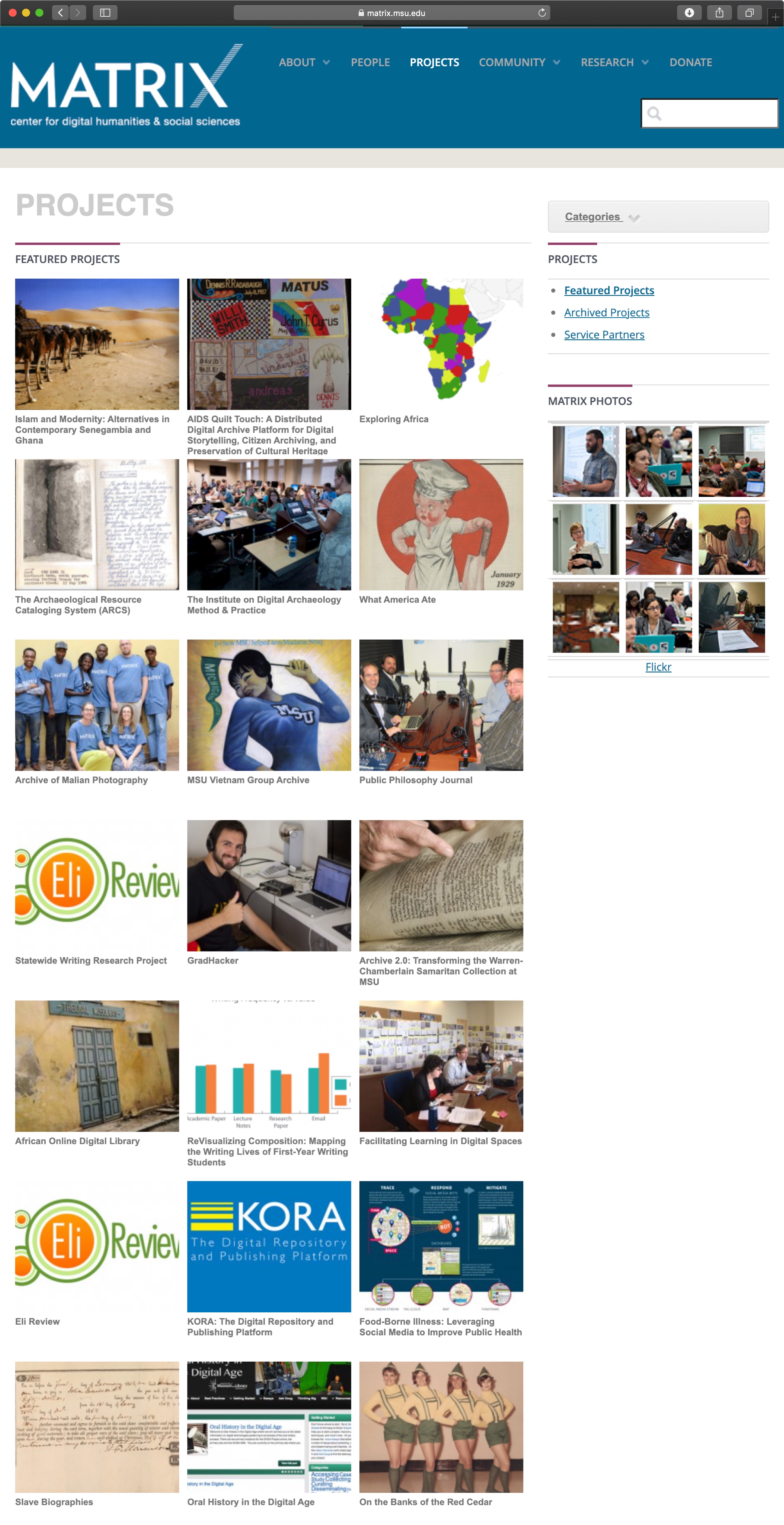
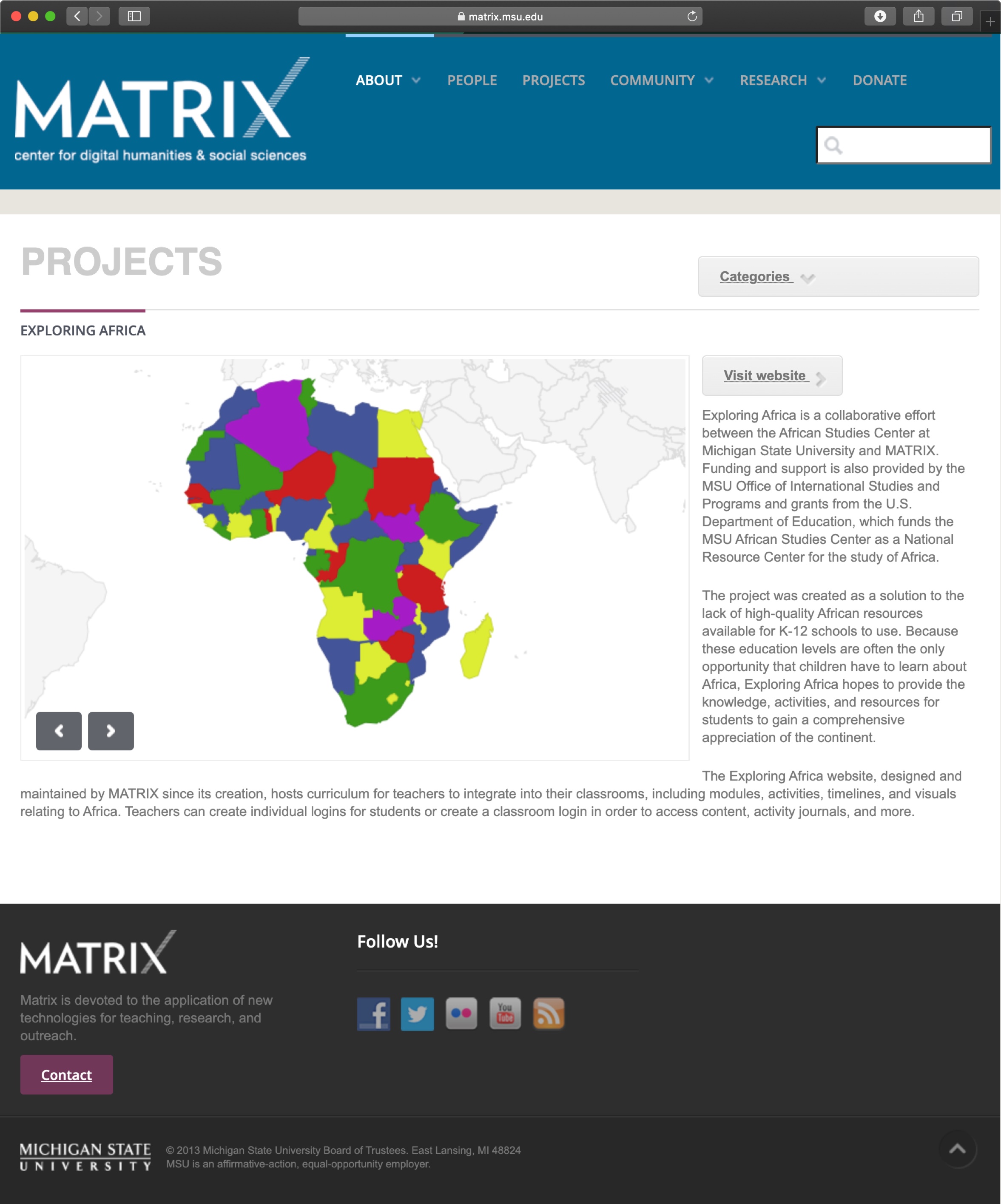
Previous Site Design
We also knew that the site should better follow MSU's brand standards, and needed a serious facelift... The following screens are what the site initially looked like.
Problems to Solve
With all this in mind, we clarified what problems we needed to solve:
- A more modern site design
- Bring projects front and center to be quicker and easier to access
- Simplified navigation
- Updated branding that better suited MSU's brand standards
- Ability to search for and filter through Matrix's long list of projects
- More detailed project pages, with information on funding, and easier ways to reach social media and donate pages
- Make it clearer what Matrix's mission is
- A clearer way to donate to Matrix or to individual projects
Process
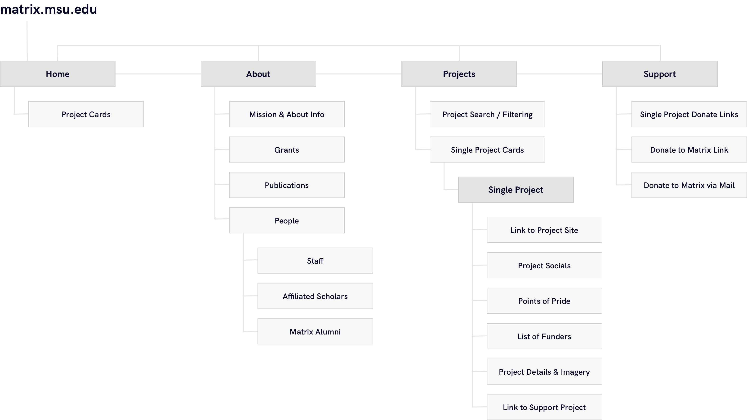
Site Map
After a thorough review of user analytics on how users were using matrix.msu.edu, we dicovered that many features were going untouched. So we removed several pages, including the site's blog/news setup and it's search functionality, and simplified the site heirarchy into four main views; Home, About, Projects, and Support.

Wireframing
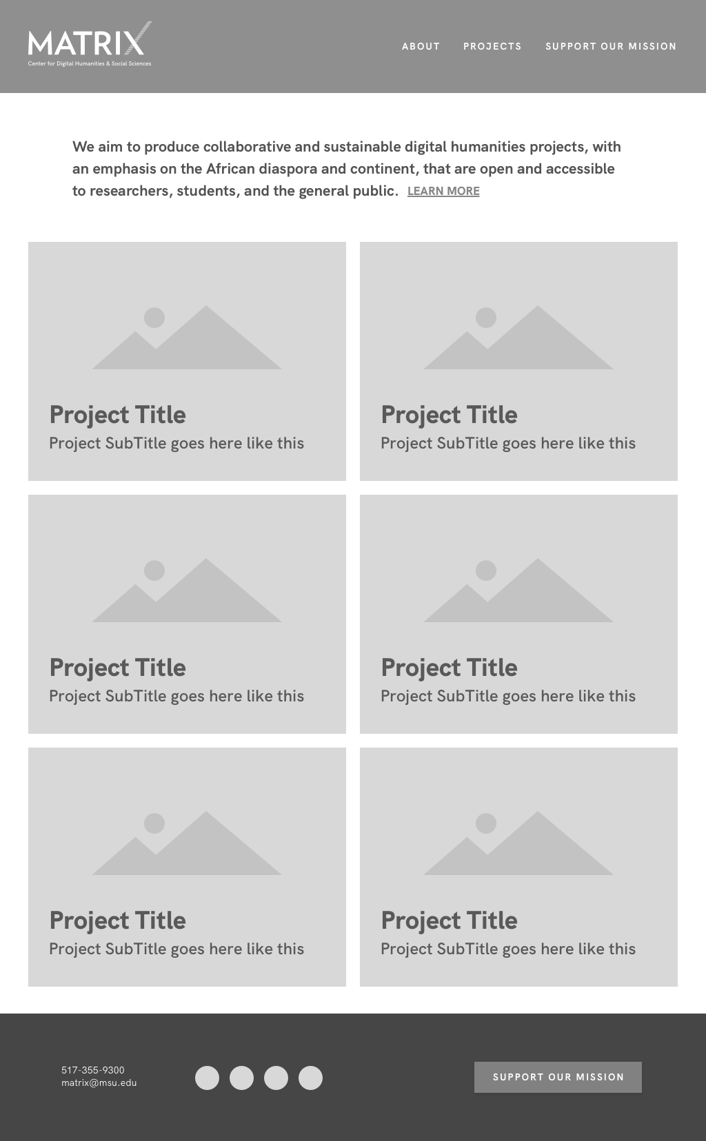
Home
Knowing users were mostly keen on seeing our projects, we added large project cards front and center on the home page, with little to nothing else except a brief about section.

Single Project
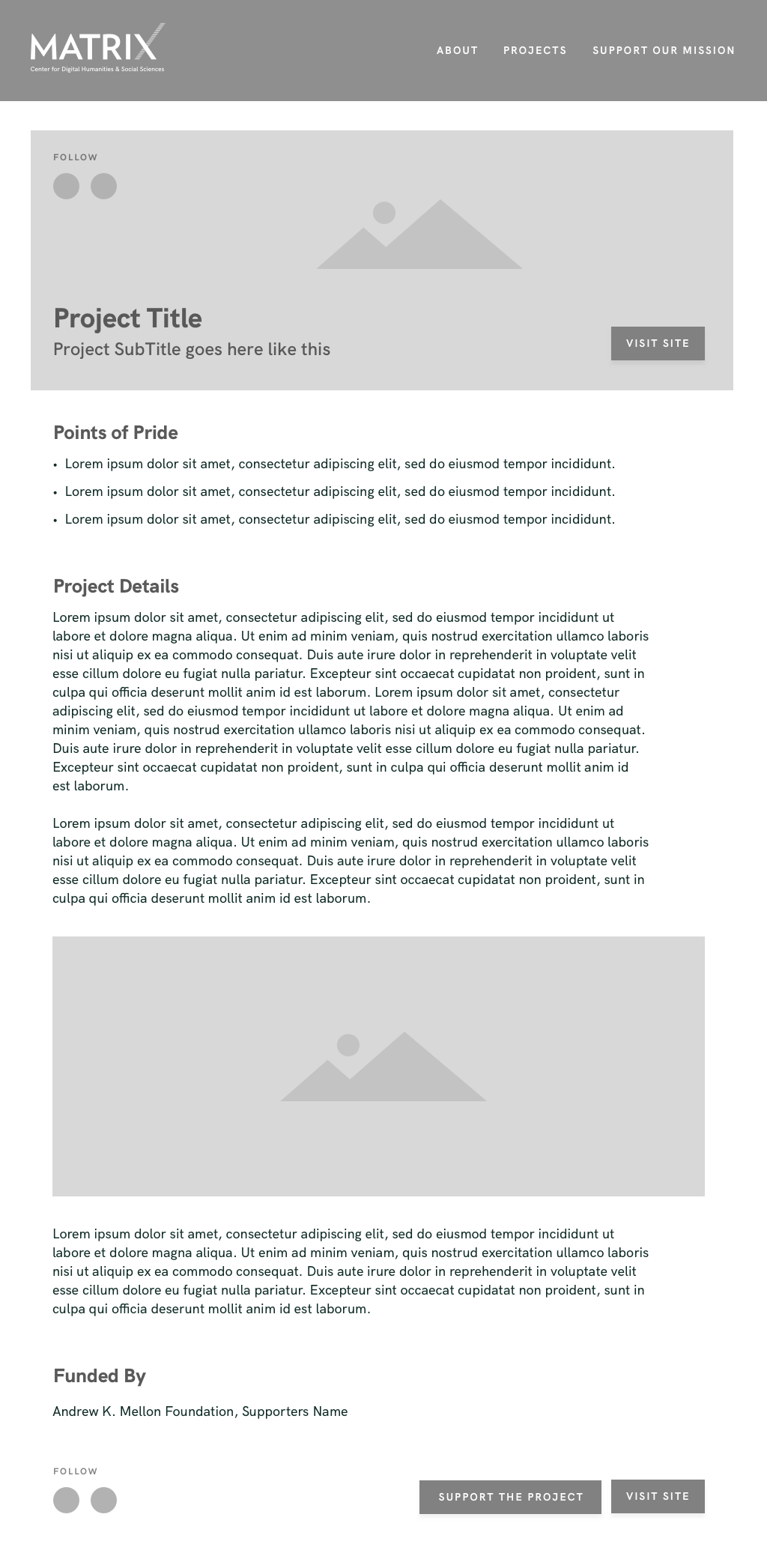
For each project, we wanted to provide a more engaging experience to peak inside what the project has to offer. Every project now has it's own detail page, offering users an easy way to find out specific project details. Users can quickly see the main goals of the project, how the project was funded, imagery of the project and a brief project description. Most importantly, it is now easier than ever to jump to the project's URL, to support the project, or to view any of the project's according social media.

Projects
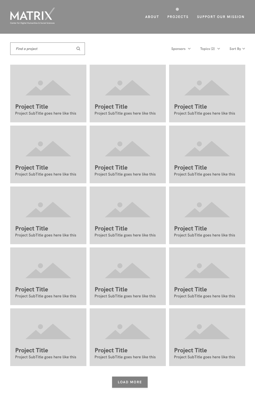
Matrix has over 100 different projects ranging back to the early 1990's. With so many projects we wanted to include a way to easily view and filter through them. The new Projects page now offers a way to search by keyword, filter by topic, or filter by sponsor.

Support
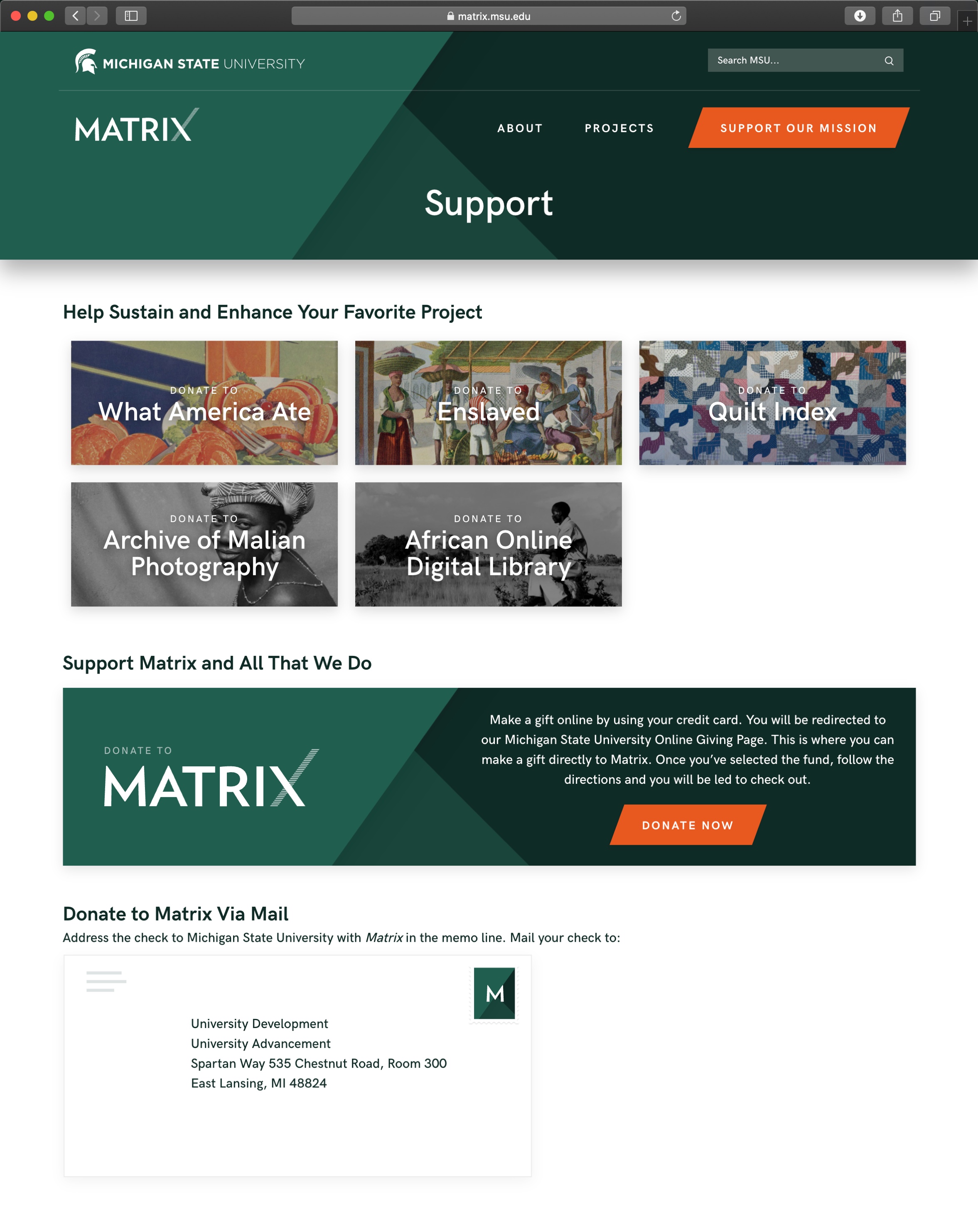
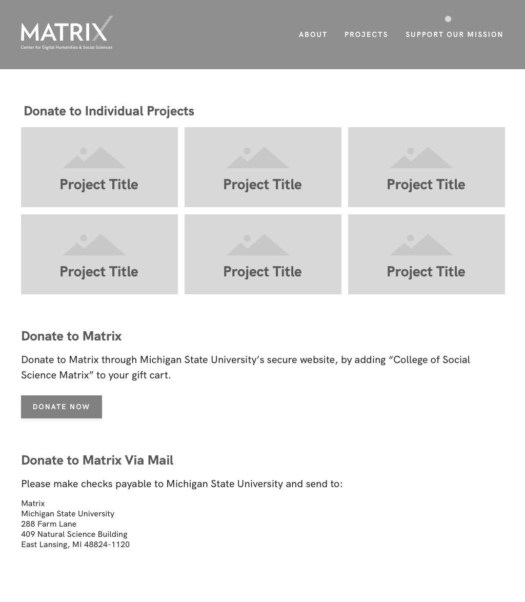
Supporting Matrix used to be a confusing process, especially when users wanted to support a specific project. With the redesign we added the ability for users to distinguish whether they're donating to a single project, or Matrix as a whole.

About
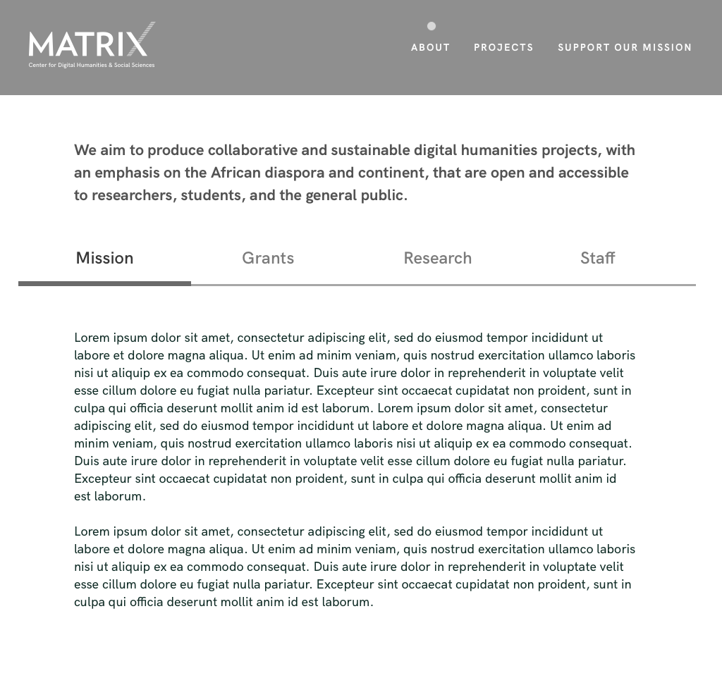
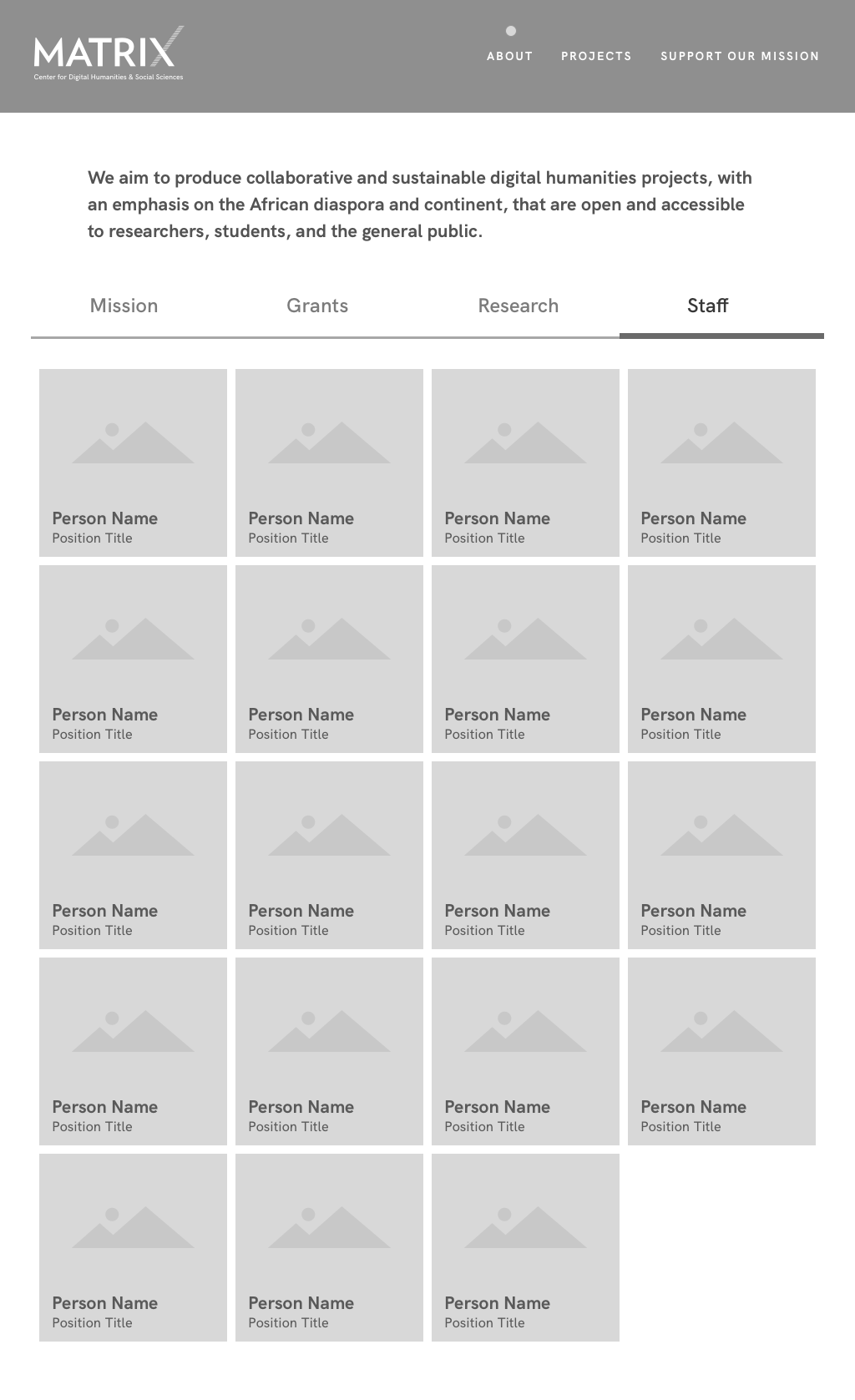
The updated About page was designed in a way so our mission statement is front and center on all about pages to make it clear what we are all about. We also simplified our About page down to four sections: Mission, Grants, Research and Staff. Our main staff section also saw a major update, with a clean grid of staff cards, that are clickable to reveal more information.
Visual Design
The final designs for Matrix's site design can be seen below. Changes that occurred after the wireframe process are pointed out. The best way to experience the final design is seeing it live at matrix.msu.edu
Home
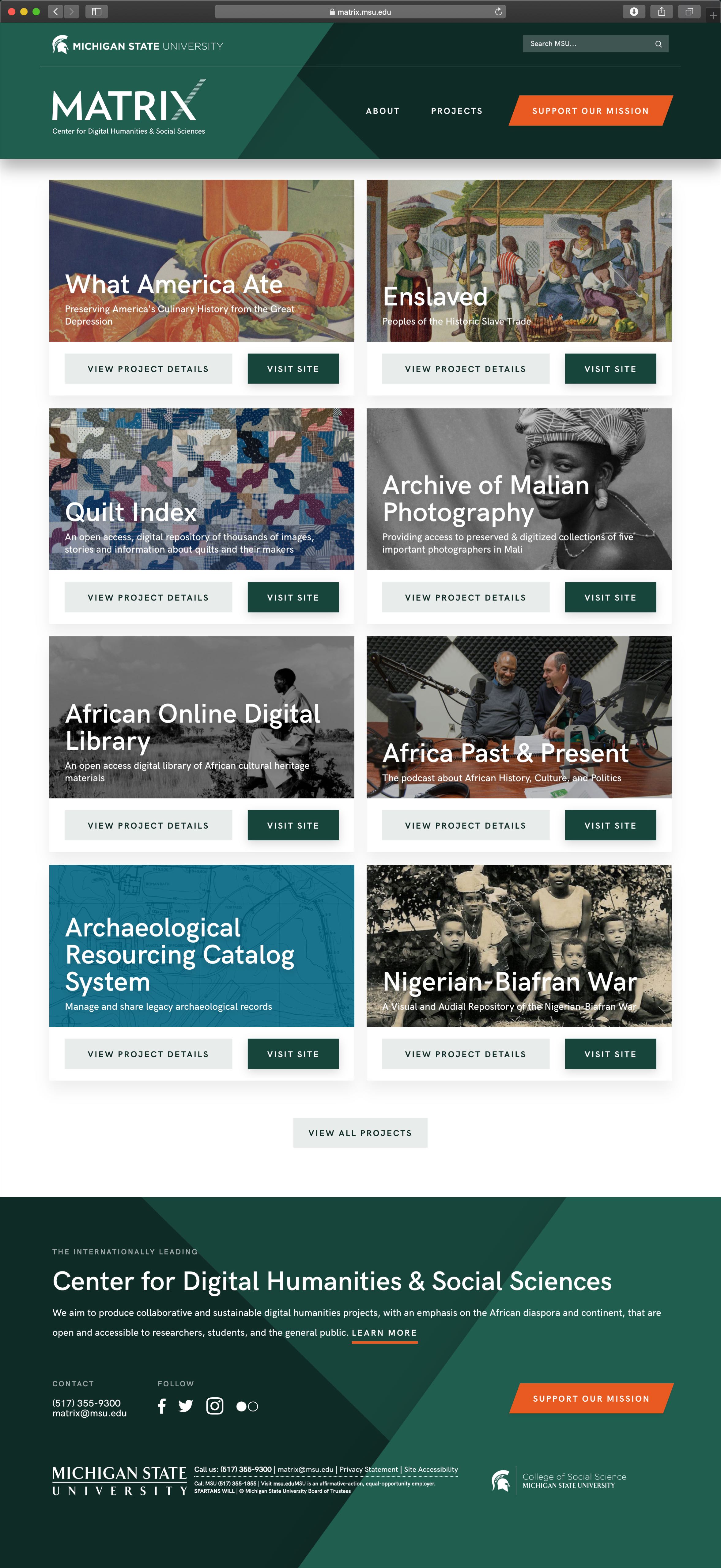
For all project cards, we added the option to jump directly to the project's url, instead of having to go to the project's detail page first. We also moved the brief about section into the footer, allowing the projects to be even more front and center, and to have the about section be available on all pages.

Single Project
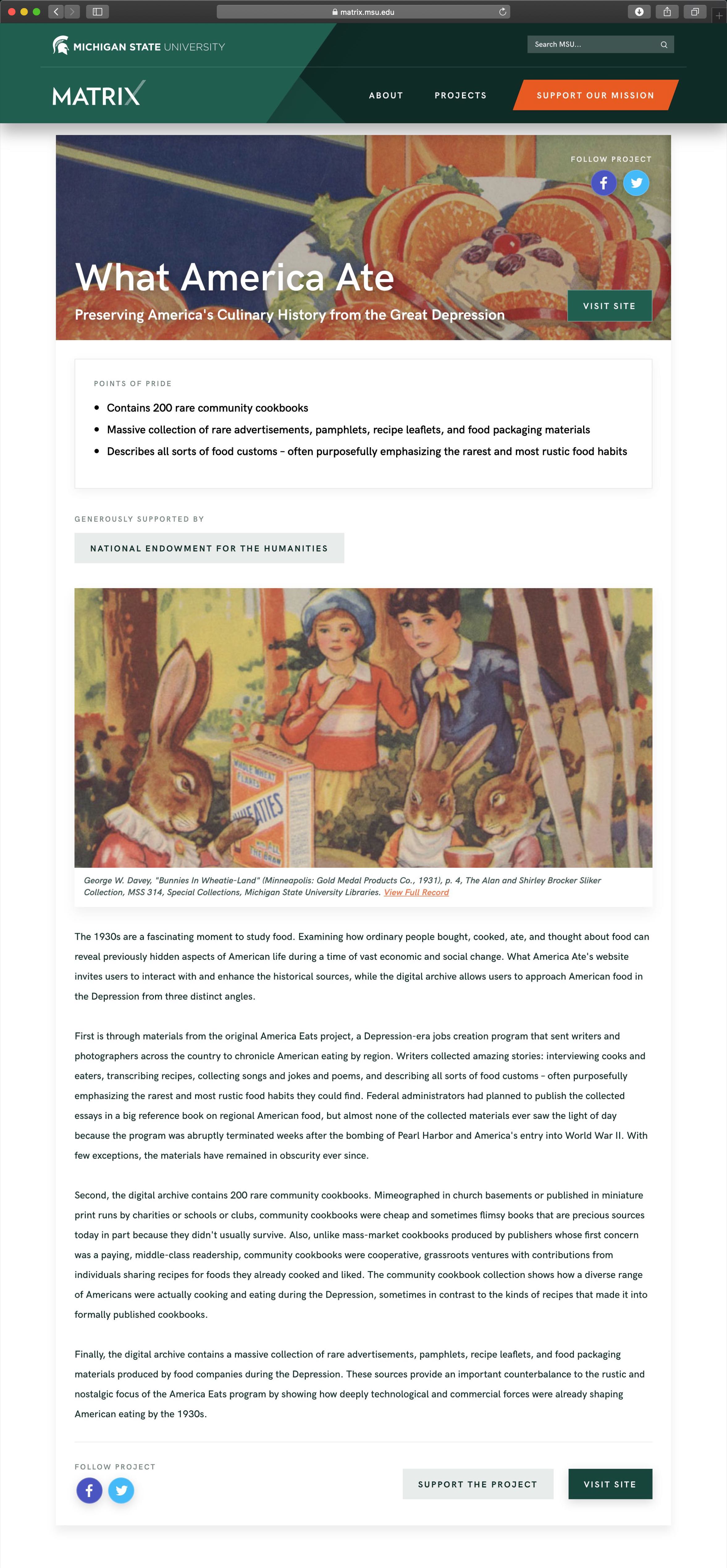
Since the funders for each of our project play such an important role, we moved the Funded By section closer to the top of the page, and gave each funder it's own button that will take the user to the funder's website.

Projects
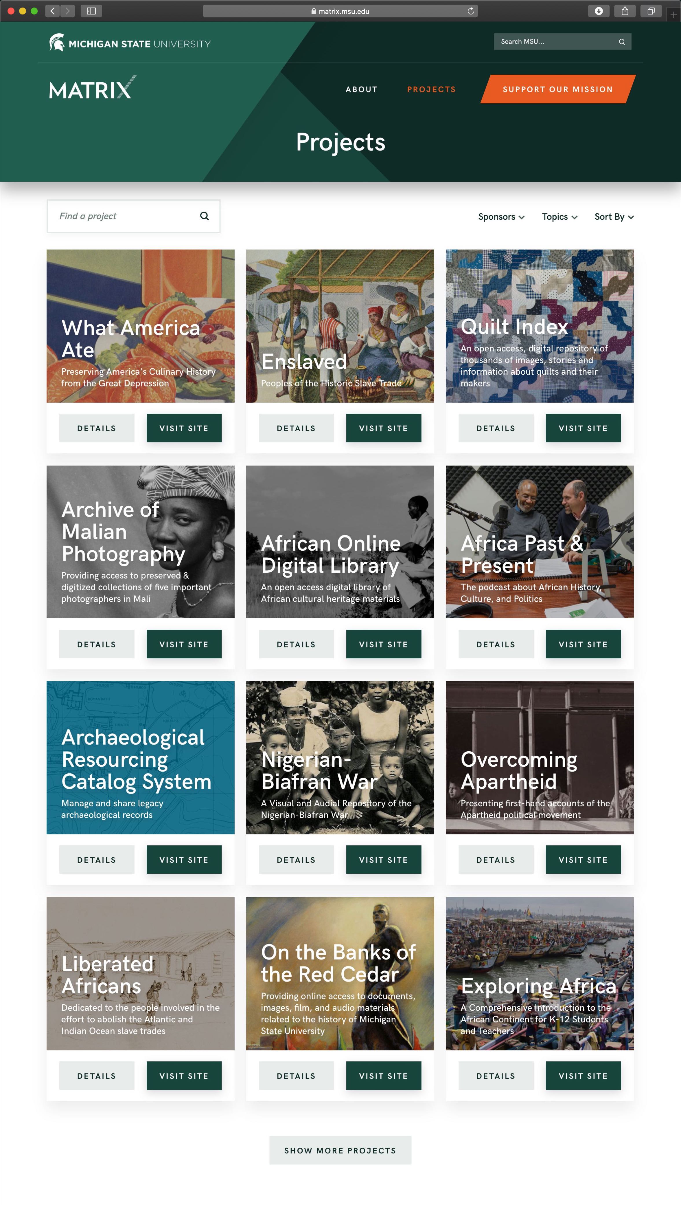
Sub pages were given a title to make it clearer which page the user was currently on.

About
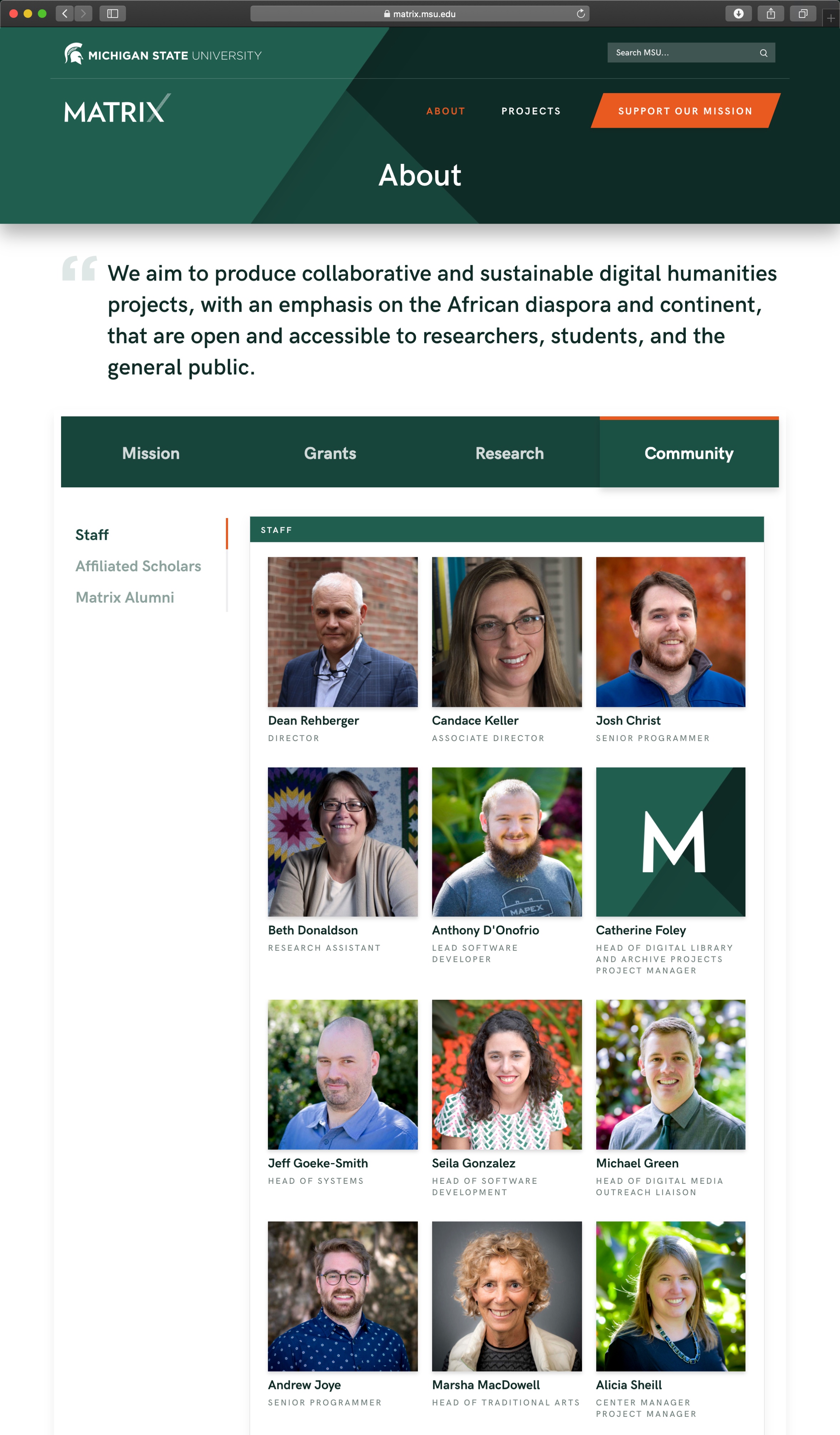
The Staff tab on the about page was updated to be Community. The Community page is seen below, which features three sections that are navigable by a fixed scrolling side navigation. The tab bar was also visually made more impactful, and to feel more interactive.

Support
The Donate to Matrix section was updated to have a greater visual impact, featuring a banner with the site's new branding. The Donate via Mail section was also made more engaging, by adding a subtle envelope with a stamp to enclose the address.

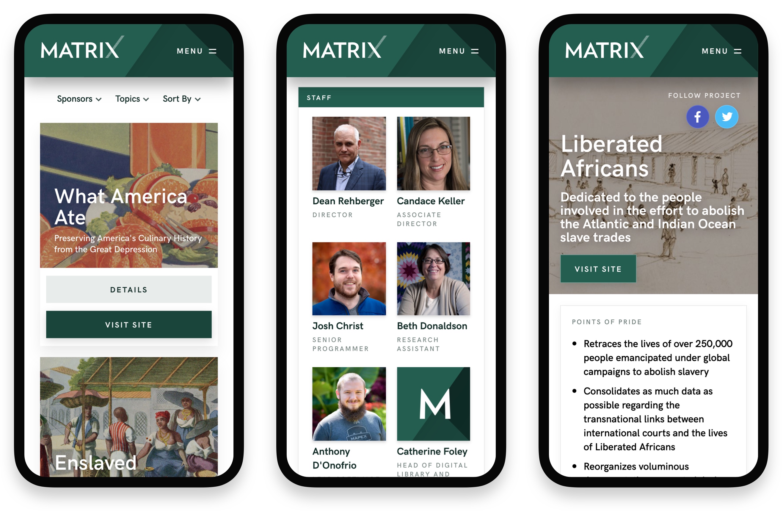
Mobile Design
And of course the new Matrix site is fully responsive. Another major improvement from the previous site. Checkout the live site and resize the page!

Style & System
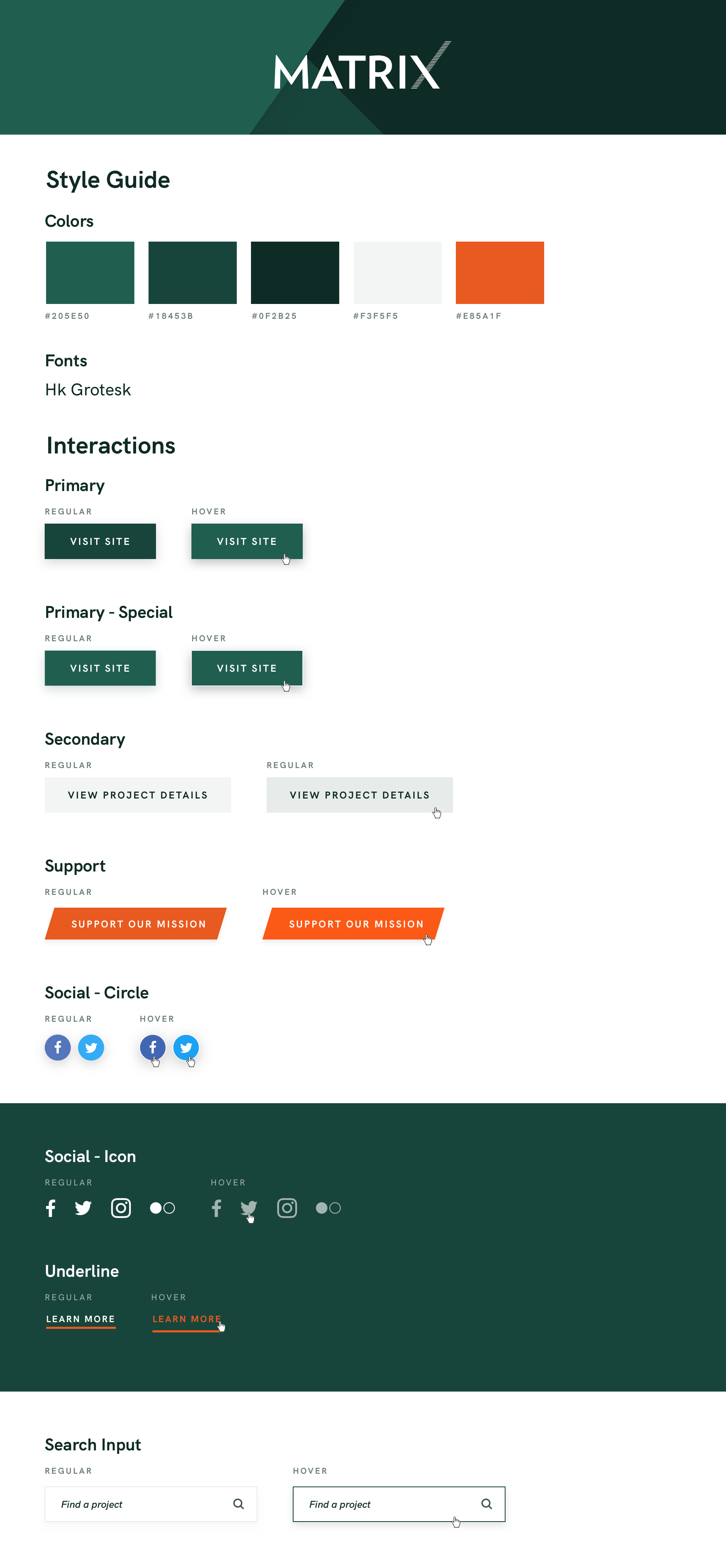
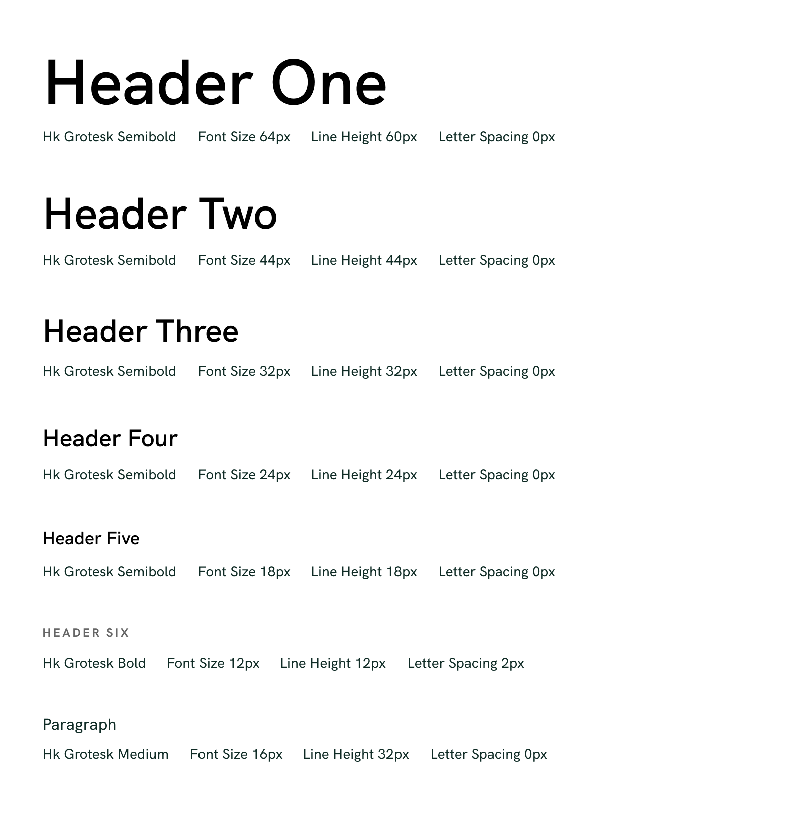
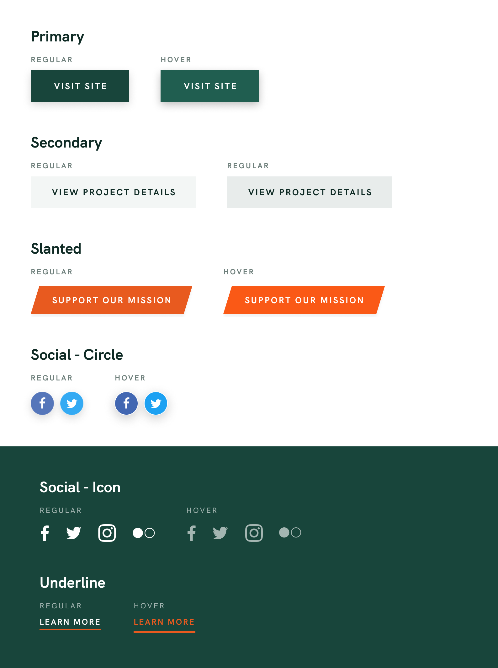
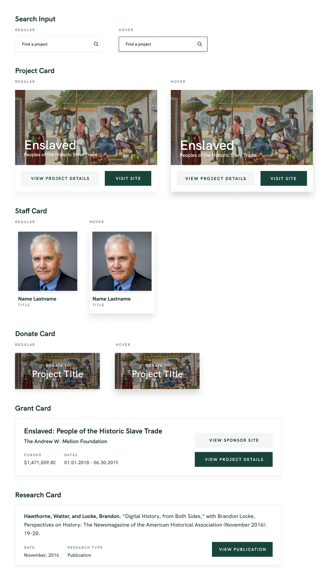
The new colors used in the redesign were based off of Michigan Statue University's green in order to fit within their branding. As a department of MSU, we felt this consistency was important. Using the colors and arranging them at various angles helped connect them to the angles of the Matrix logo, as well as provide some depth. We also wanted to make sure that Matrix held it's own identity within the MSU brand, so we added a pop of orange to act as our accent color, which both compliments and breaks away from the MSU brand. The following is a simple brand guideline along with interaction examples. View Figma File

Further Findings
After additional testing and reviewing of analytics on the new site, we found that users were able to get where they were going in a significantly fewer number of clicks. I sat down with several users who were grad students at MSU, and who were familiar with the old site, but not the new site. I asked them each to get to the official enslaved.org site from the matrix site, and also begin a donation to the enslaved project. Through a talk-aloud session, all users completed the first task in one click (previously 3-4 clicks), and they completed the second task in two to three clicks (previously 6-7 clicks). Users agreed that the new site made it much simpler and clearer to dive into and learn about our projects and to start the donation process.
We continued studying the analytic data and found there to be a 78% increase to visiting single project pages when first coming to the site. This fulfilled our goal of allowing projects to be quicker and easier to access. According to the analytics, we also saw that 8% of users then went on to select the "Support the Project" button to begin the donation process (up from 0%), and 19% of users went to our Support Our Mission page after landing on our home page.

View the full site at matrix.msu.edu
