
Tymr
MacOS & iOS App Concept
A Personal & Team Based Time Tracker
Overview
Tymr is a conceptual Mac, iPhone and iPad application for personal and team based time tracking. For this exercise, I focused on what the interface could look like for an admin user that was viewing their own time records and activity. Tymr is my own exploration of what a cross-device time tracking app could be.
Origin
After being fed up with my work's own custom built time tracking software, I wanted to imagine what a well designed time tracking app could look like, and how it might look cross platform, on the desktop, on a tablet and on a phone. After looking around for alternatives, I couldn't find any time tracking software that was natively built for Apple's ecosystem. Everything I found was web based, had poorly designed interfaces, and had inconsistent experiences from desktop to mobile. And finding a time tracking app that was built to have a solid experience for personal AND team based time tracking was near impossible.
Problems to Solve
With conceptualizing Tymr, I wanted to solve the following problems and include them as features:
- Ability to quickly start a timer with a task and project assignment from any page
- Easily editable time records, to adjust date, time, task and project
- A customizable dashboard to allow users to personalize which data is most important
- Scheduling functionality, allowing users to set and edit their schedules, and even request timeoff
- See a log of past payments, planned payments, and stats on how much was earned in a timespan
- Project management and setup for team based admin accounts
- Time record management and setup for team based admin accounts
- Members management and setup for team based admin accounts
- Schedule management and setup for team based admin accounts
- Payroll management and setup for team based admin accounts
Process
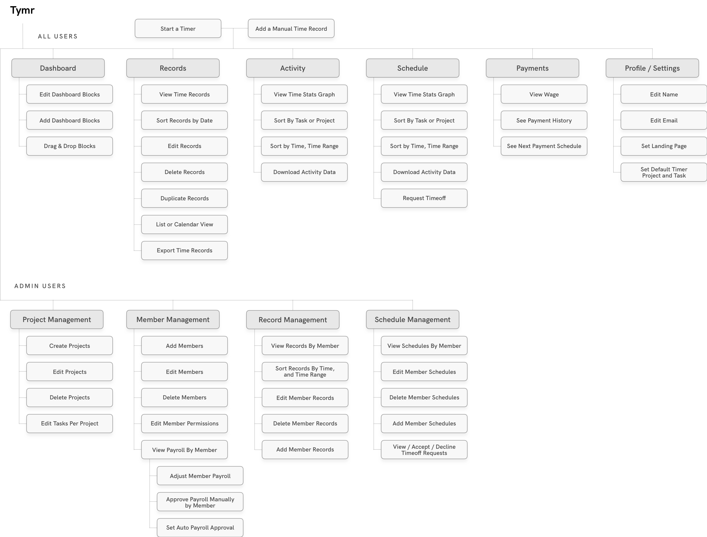
Feature Map
I decided to break the app down into two main sections, one for all users and one for admin users. For all users, I broke down the features into six main pages, Dashboard, Records, Activity, Schedule, Payments, and Settings. Starting a timer, the main functionality of the app was mapped out to be accessible from every screen. Users with admin privileges would be able to see additional options within their navigation, for project, member, scheduling, and payment management.
Wireframing
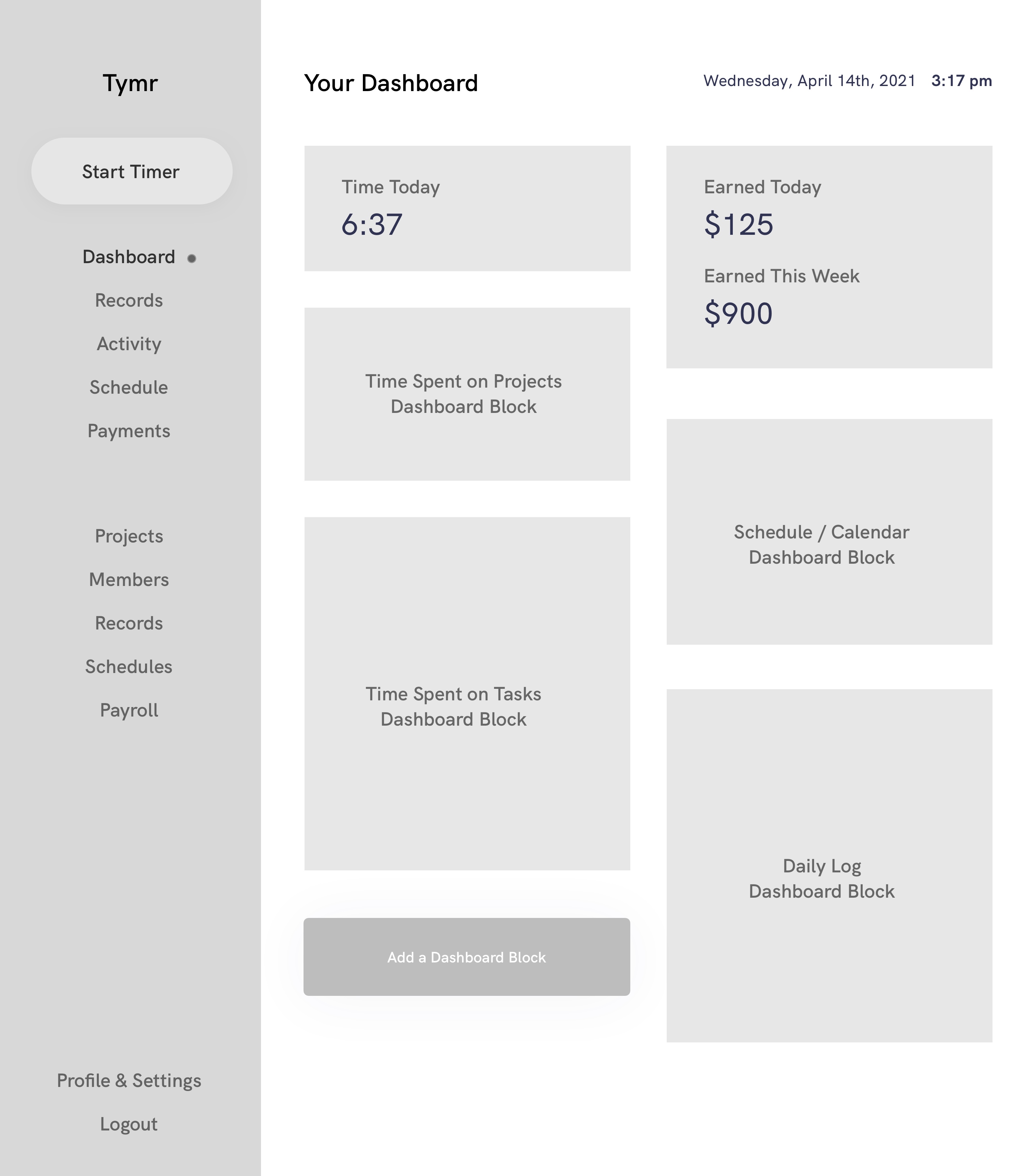
Dashboard & Timer
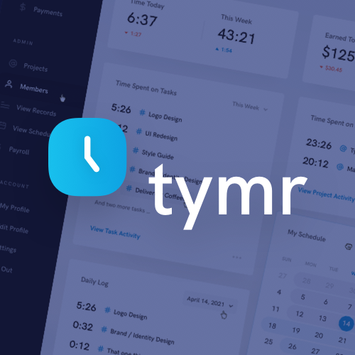
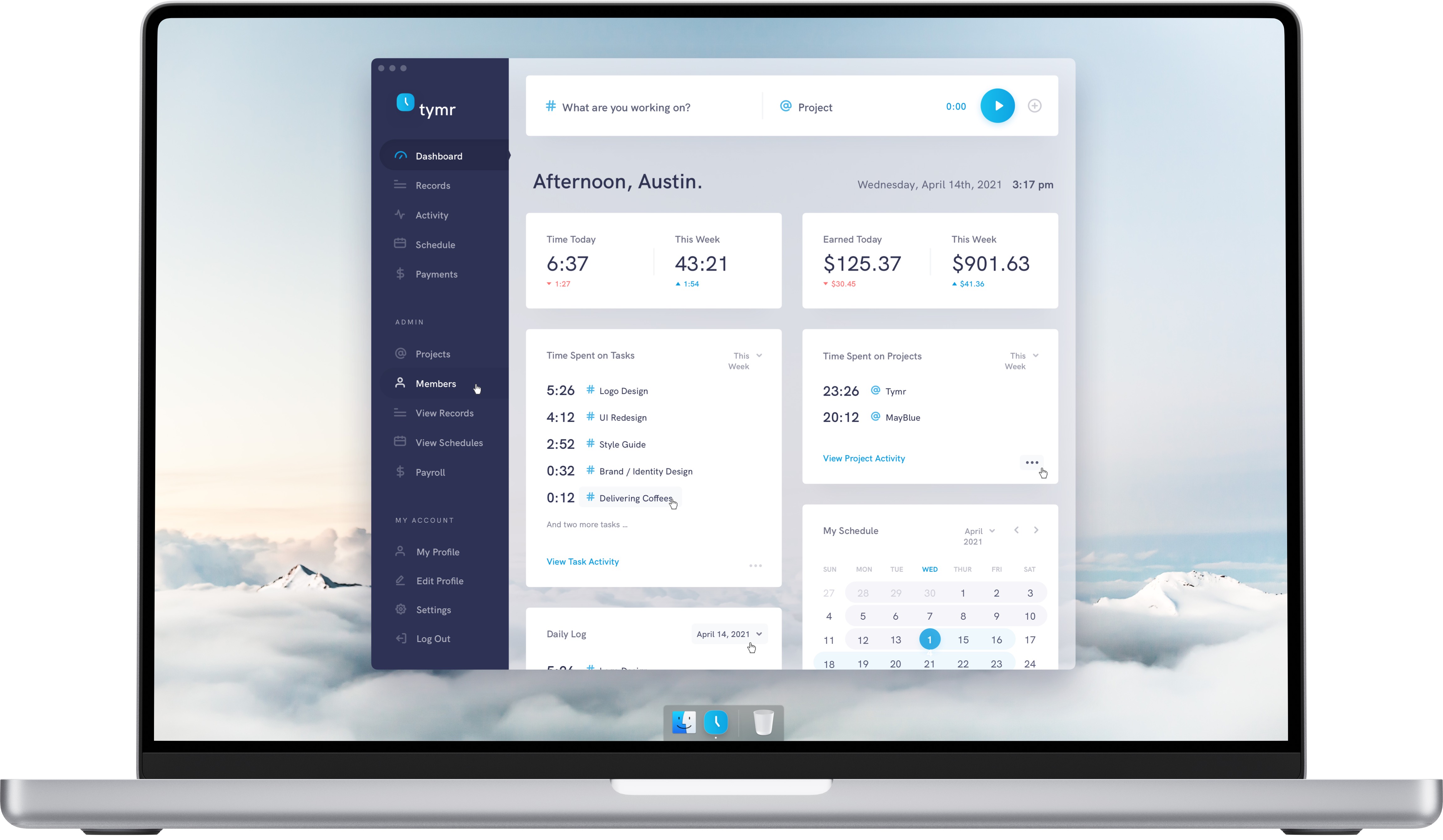
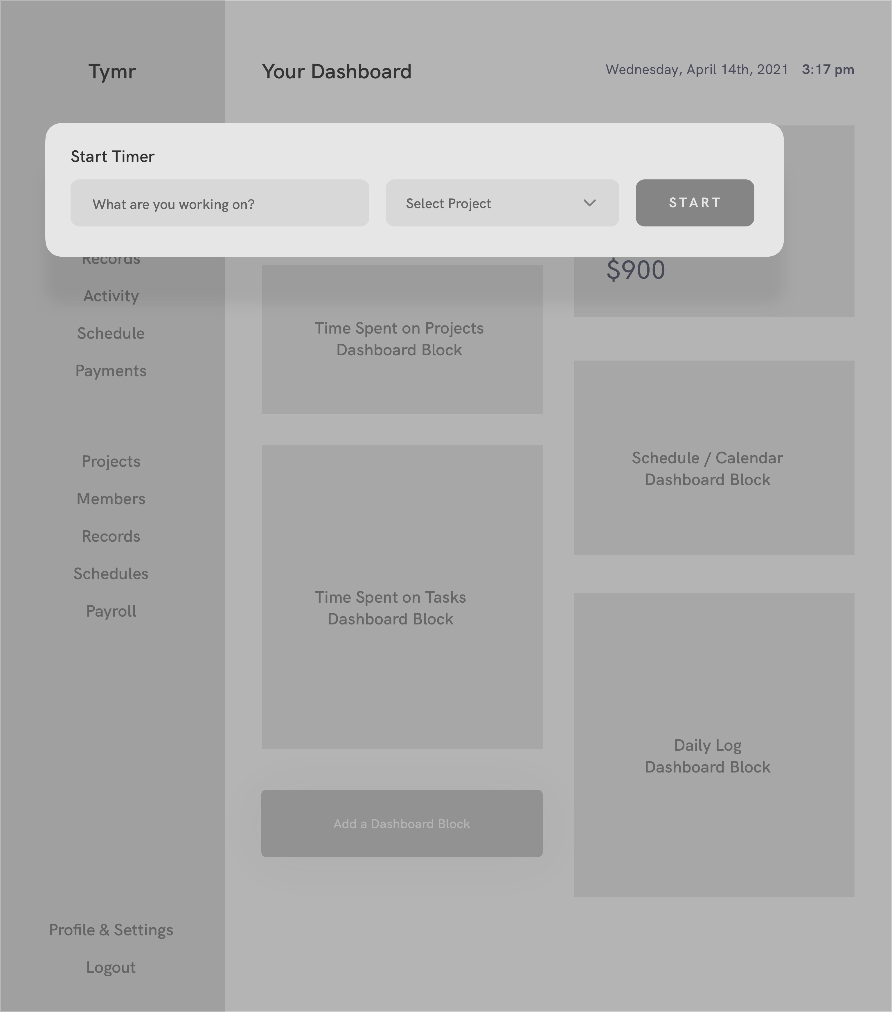
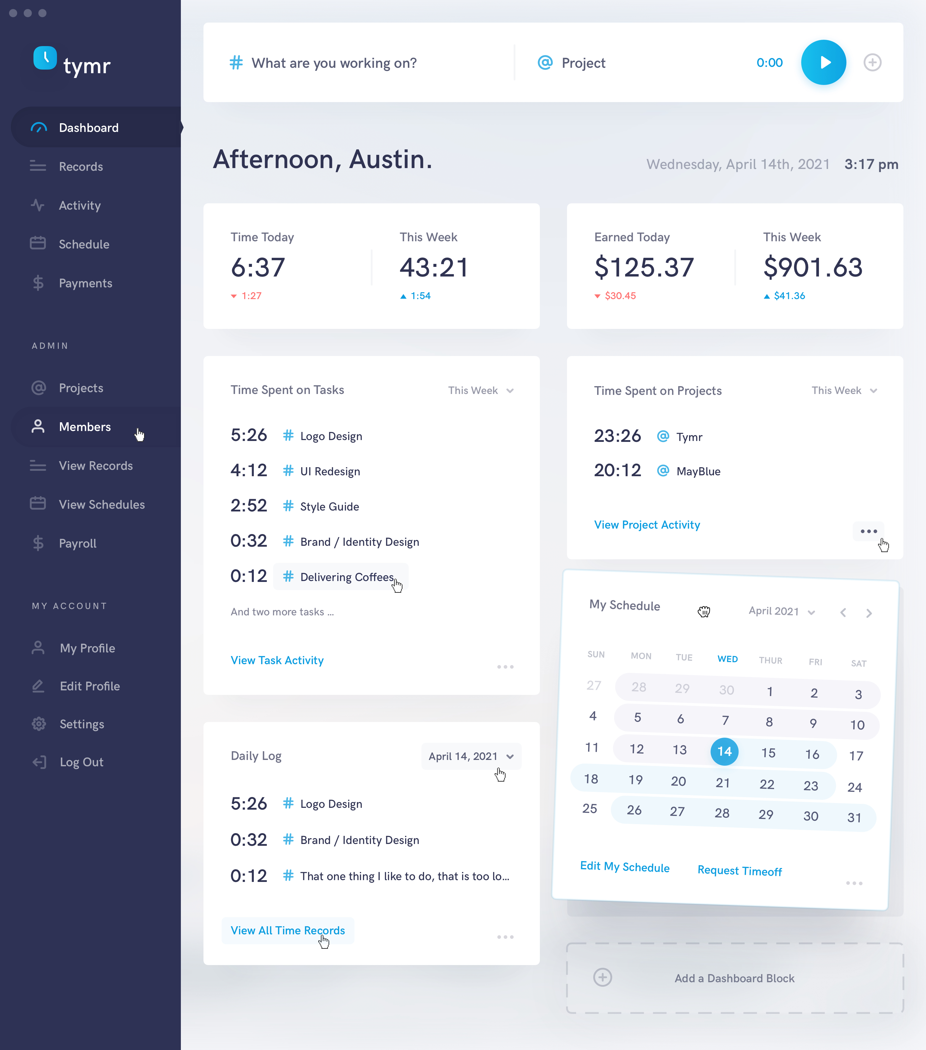
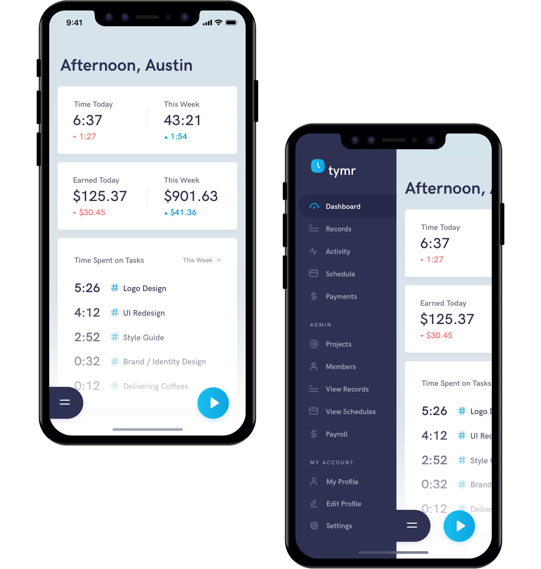
The Dashboard acts as the home page to Tymr, quickly highlighting key information that is important to the user. The Dashboard is built up of customizable blocks, that can be dragged and reordered, or removed from the dashboard. This allows the user to put information that is most important to them front and center. At the top of side navigation exists the start timer button. This gives the user quick access to start a timer, to add a task and project, or to see the how much is on their active timer. Selecting this button will bring up a small modal with the according options.
Records & Activity
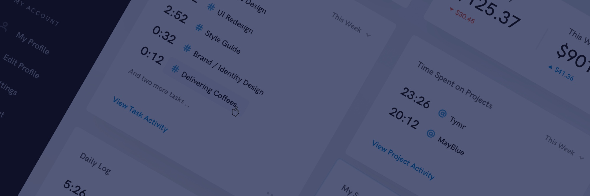
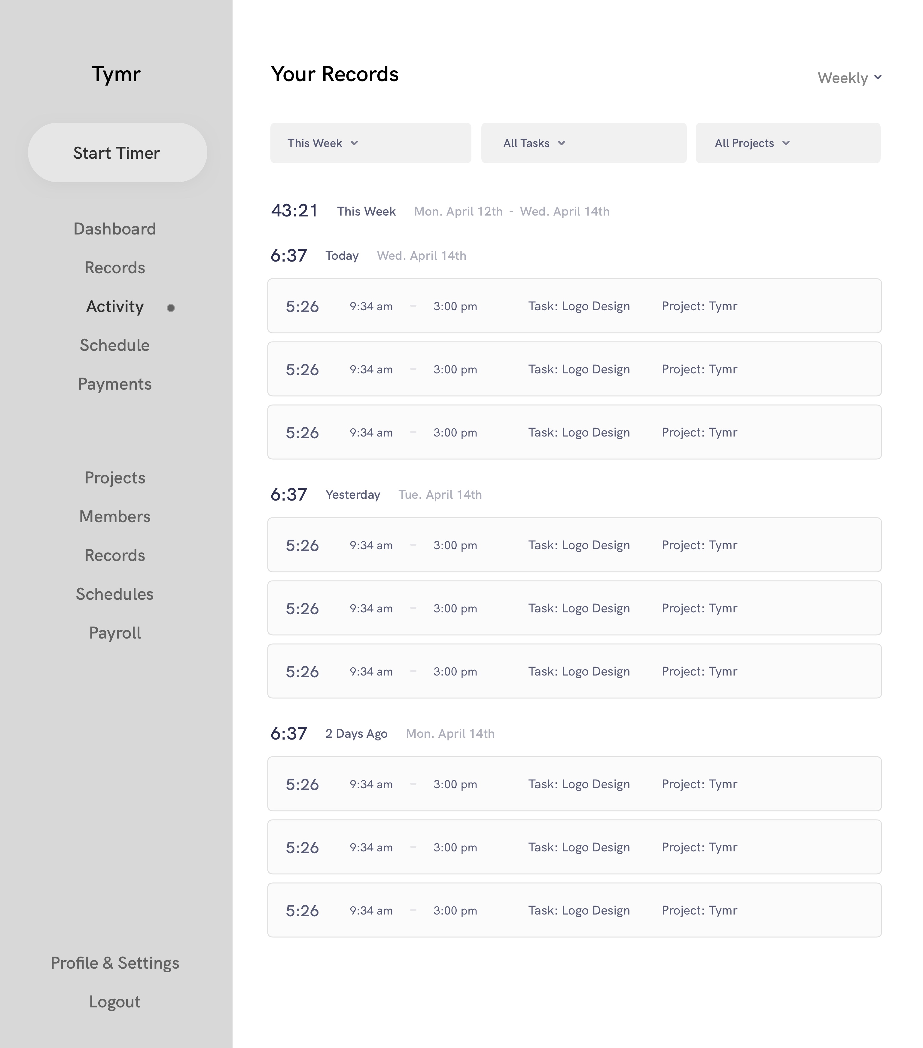
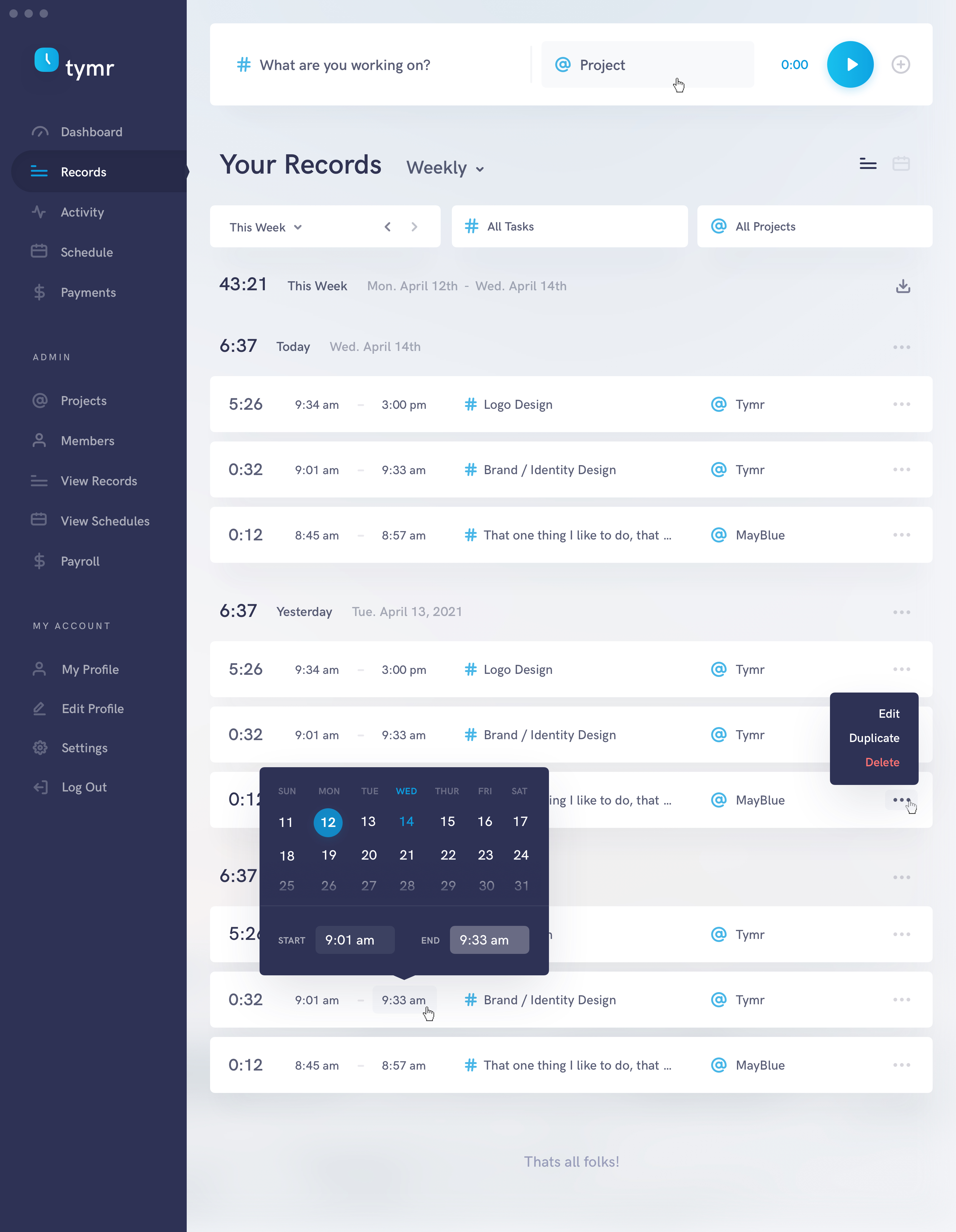
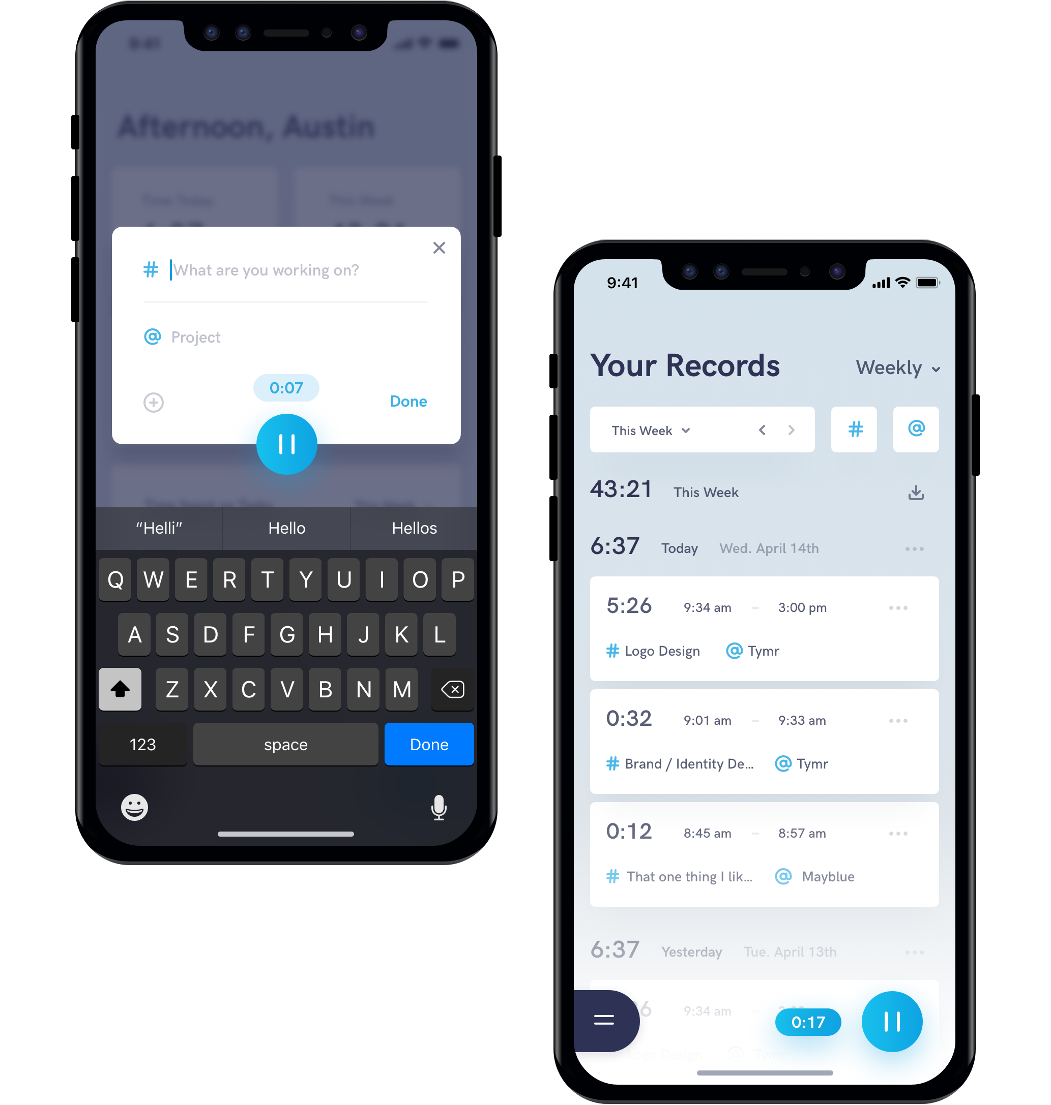
The Records page is the place to go see all of your tracked time. The user can view their time records in a weekly, monthly, or yearly format, and can view them in a list or calendar view. The user is also given filtering options to select the exact week if viewing records weekly (defaulted to the current week), and options to filter the records by a certain task or project.
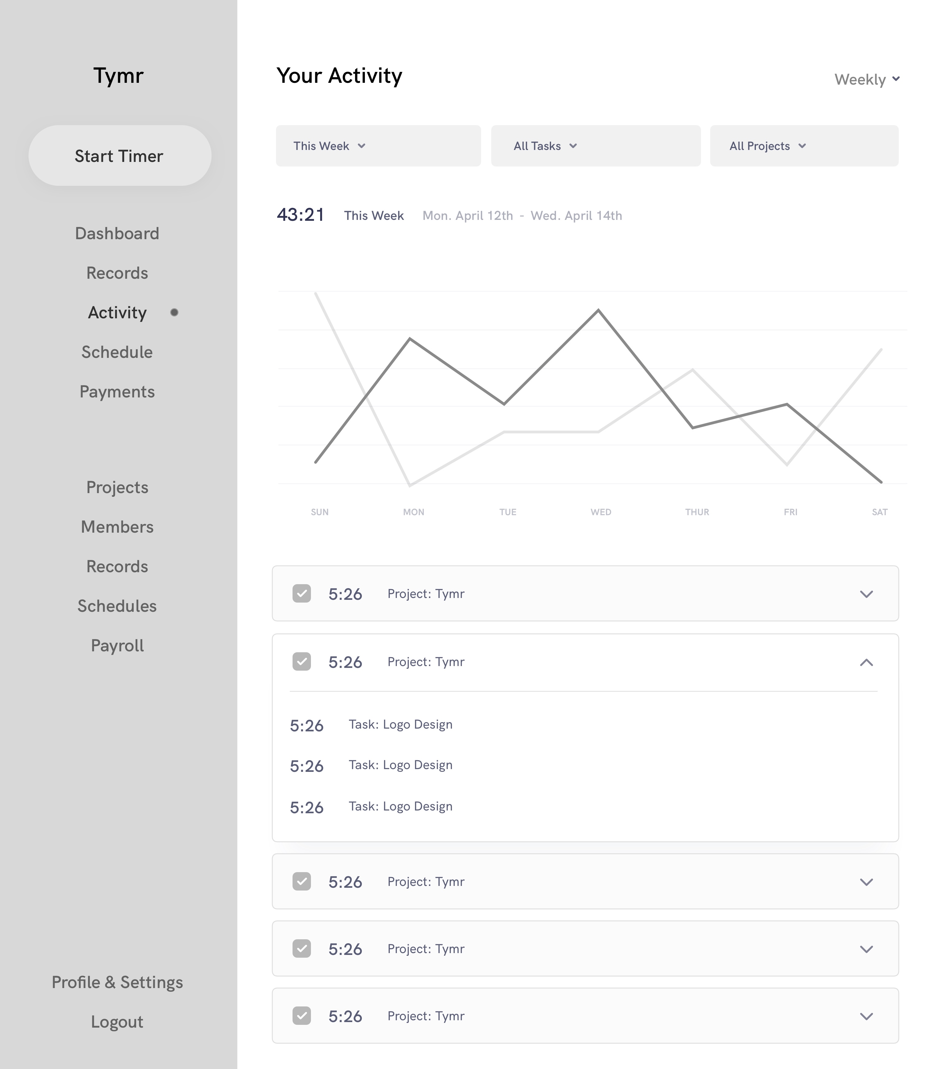
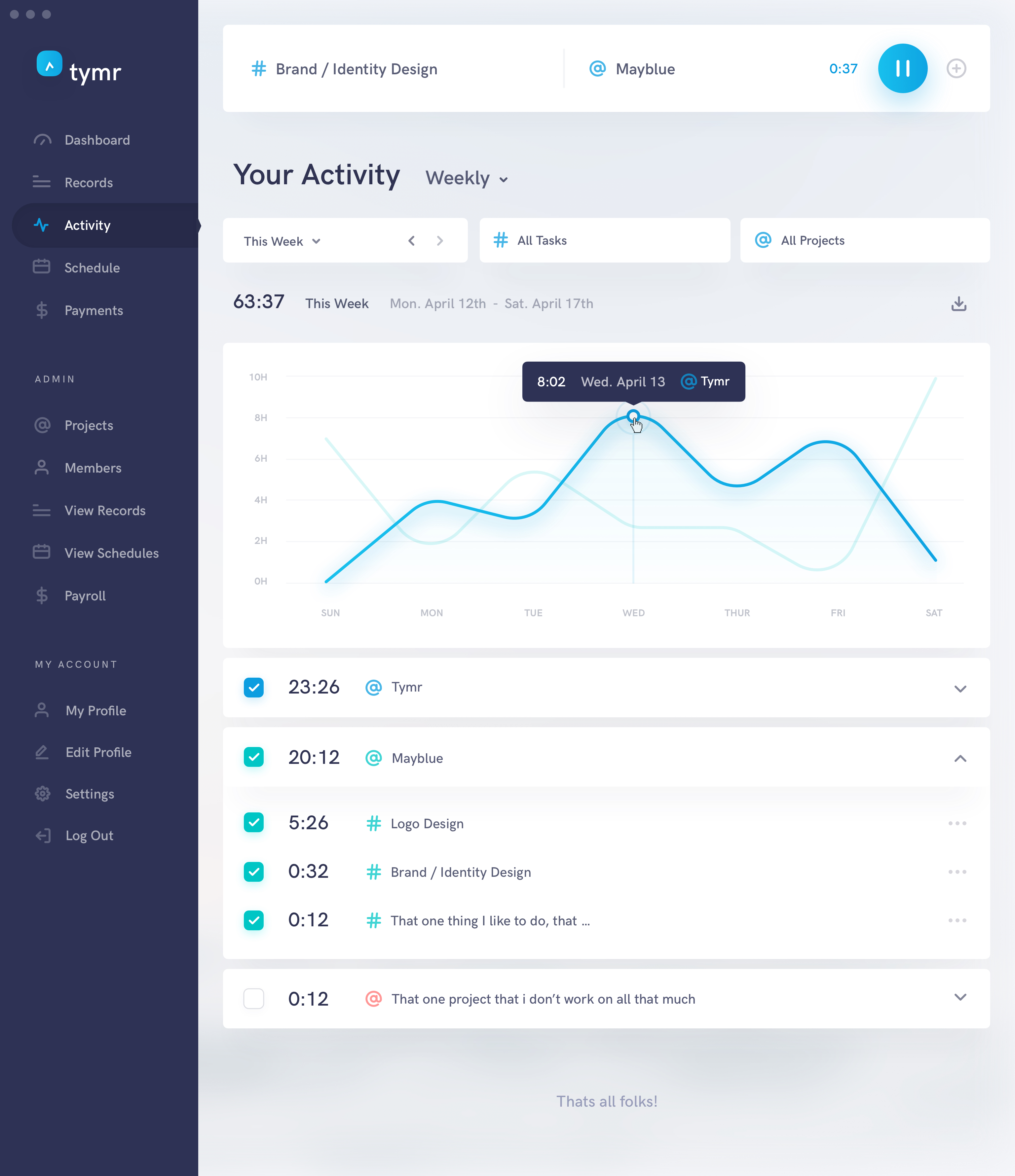
The Activity page allows the user to see a graphical view of their work progress over time. Here we can see a graph representing the number of hours worked for the user the past week day by day. Beneath the graph lists the projects that were worked on this week, or the selected time interval, with the option to hide or reveal them from the graph.
Visual Design
The following are the final visual designs, including text highlighting any changes that were made coming from the wireframes.
Dashboard & Timer
The biggest change I made coming from the wireframes was turning the timer modal into a fixed element at the top of every page.This gives the user even quicker access to start a timer, to add/update a task or project, or to see the how much is on their active timer. There is also a now plus button next to the start timer button, that allows the user to enter a manual time, in the case they forgot to previously.
Records
For the Records page, an additional view option was added to view the list of records in a calendar format. A tooltip was also added here to showcase how a user might edit a time record. They can change the start and end dates and times, as well as the task and project.An example of what the tooltip for selecting the more options icon at the very right of each record is also shown, to open up advanced editing options, to duplicate or to delete the record entirely. A download button was also added, offering users a way to take their data offline in a pdf, xml or csv format.
Activity
For the activity page, a tooltip was showcased to highlight how a user might interact with the graph, and a download button was also added, offering users a way to take their data offline in a pdf, xml or csv format. This mockup also provides an example of an active timer, with the task and project inputs filled out. And as an aside, I thought it would be really great if the Tymr logo in the sidebar animated like clock hands when the timer is active.
iOS & iPadOS
Tymr also conceptually has native iOS applications for iPhone and iPad as well for a seamless cross device experience. Nice! The iPhone app is structured with two fixed buttons at the bottom of each page, one to access the sidebar menu (can also be accessed by swiping right anywhere on the screen), and the start timer button.
Hitting the start timer button, well, starts the timer, and brings up a modal to fill out the task and project, add a manual time, or adjust the current time duration. As the timer is active, the duration is displayed next to the stop timer button.
And of course the full cross-device experience isn’t complete without a native iPad app. The iPad version isn’t too different from the Mac version, but is a great addition for those that prefer working on their iPads.